It is frighteningly clear to any objective analyst and/or intelligent investor that the present bull market rally in stocks (2006-2014) is beyond the pale…i.e. the excess valuation is dangerously above the market excesses of the 1920s.
The above introductory comments are edited excerpts from an article* by Vronsky (Gold-eagle.com) entitled The Most Equitable Measure Of Stock Market Valuation Is Market Cap/GDP.
Vronsky goes on to say in further edited excerpts:
The world’s richest man, multi-billionaire Warren Buffett, once observed that the best metric for determining the level of stock market’s valuation is the Market Cap/GDP ratio and, as such, the burning question today in the minds of institutional investors worldwide is: “What is the Market Cap/GDP ratio suggesting today” as the Dow and S&P500 Indices are churning at all-time record highs?
Compound Annual Growth Rate Comparison: 1922-1929 vs. March 2006 to Date
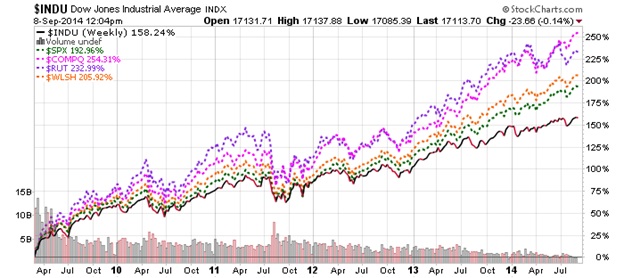
To objectively answer this provocative question, we need to analyze what stocks have done since early March 2009, when the US Fed initiated Quantitative Easing (QE) with a view to avert a stock market meltdown similar to the 1929 Stock Crash. The chart below shows the Performance (i.e. appreciation) of US major stock market indices (Dow, S&P500, NASDAQ, Russell 2000 & Wilshire 5000 Indices).
http://tinyurl.com/p9hvnp8
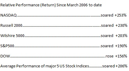
The +206% increase during this period is equivalent to an astounding Compound Annual Growth Rate (CAGR) of +25% – an almost unprecedented price gain in U.S. history. During the infamous Roaring 1920s (1922-1929) stocks rose in value by 218.7% which was equivalent to an 18% CAGR in value over those 7 years…
Buffett’s Market Cap/GDP Ratio
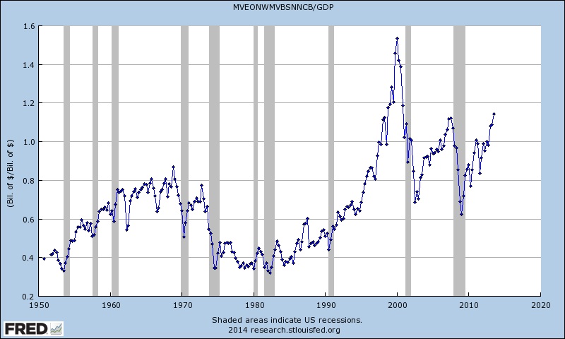
Market analyst Doug Short created the following two charts for the Buffett Indicator”…[qualifying each by saying]:
“The raw data for the “Buffett Indicator” only goes back as far as the middle of the 20th century. Quarterly GDP dates from 1947, and the Fed’s B.102 Balance sheet has quarterly updates beginning in Q4 1951. With an acknowledgement of this abbreviated timeframe, let’s take a look at the plain vanilla quarterly ratio with no effort to interpolate monthly data or extrapolate since the end of the most recent quarterly numbers. Here is a chart I created using the Federal Reserve Economic Data (FRED) data and charting tool.”
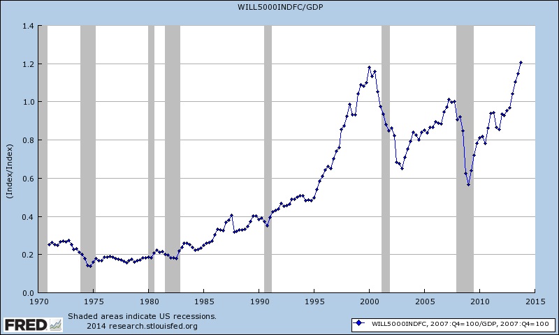
Short goes on to say: “For those of you who may have reservations about the Federal Reserve economists’ estimation of Market Value, I can offer a more transparent alternate snapshot over a shorter timeframe. Here is the Wilshire 5000 Total Market Full Cap Index divided by GDP, again using the FRED repository charting tool.”
What Do These Charts Tell Us?
According to Doug Short: “Both the “Buffett Index” and the Wilshire 5000 variant suggest that today’s market is at lofty valuations. In fact, the latest quarter in the Wilshire version is the third highest in its history, fractionally topped by two quarters in 2000.”
Conclusion
Prudent investors should beware of a possible stock market crash brewing on the horizon…which may be the prime reason why billionaire Warren Buffett’s flagship (Berkshire Hathaway) has an all-time record $57 billion cash hoard.
Today’s stock valuation is more grossly exaggerated and unrealistically inflated than in the 1920s. Historic testament suggests today’s pie-in-the-sky lofty stock prices are irrational and driven by the artificial force of the Fed’s QE and fueled by illogical investor complacency.
Editor’s Note: The author’s views and conclusions in the above article are unaltered and no personal comments have been included to maintain the integrity of the original post. Furthermore, the views, conclusions and any recommendations offered in this article are not to be construed as an endorsement of such by the editor.
*http://www.gold-eagle.com/article/most-equitable-measure-stock-market-valuation-market-capgdp
If you liked this article then “Follow the munKNEE” & get each new post via
- Our Newsletter (sample here)
- Twitter (#munknee)
Related Articles:
1. SELL! U.S. Stock Market Is An Investor’s Nightmare – Here’s Why
The stock market is presently a roulette wheel with dimes on black and dynamite on red. We continue to have extreme concerns about the extent of potential market losses over the completion of the present market cycle. Read More »
2. We’re All Cued Up For A Bear! Here’s Why
When taking a step back and viewing longer-term gauges, we see warning signs flashing. Many of these readings are in extreme territories, and historically bear markets have occurred from such overbought positioning. We are all cued up for a bear! Read More »
3. Take Note: A Bubble Isn’t Necessary To Have A Sharp Decline In Stocks
With valuations stretched, investors seem to be justifying their stock purchases here with the argument that we have yet to reach the mania of 1999-2000 but history has shown us that there doesn’t have to be a bubble for there to be a sharp decline in stocks. As we saw in 2007, it doesn’t mean there is no risk of a significant market decline or that valuations are compelling and that investors should be expecting above average long-term returns from here. They should not. Read More »
4. Harry Dent: Get Into Cash – Stock Market Will Crash to 5,500-6,000 By 2017!
You have to get out of stocks. Stocks have bubbled again and when they go down they’re going to go down hard. Read More »
5. Coming Bear Market Could Turn Into A Historic Crash – Here’s Why
Amazingly, we are on the verge of a global deflationary downturn and what could be a historic bear market, yet Wall Street prognosticators remain focused on the inflationary risks of excessive monetary stimulus. Their focus could not be more wrong. Let me explain further. Read More »
If the past long-term cyclical correlations between interest rates, equities, and commodities were to play out as they have done going back to the 1880s, U.S. stocks and interest rates should continue to rise as commodities either fall or underperform according to a 60-year cyclical pattern model referred to as The Market Map. Read More »
7. It’s Just A Matter Of Time Before the Stock Market Bubble Is Pricked! Here’s Why
Once again the stock market is in full bubble mode. The market was already overvalued earlier this year and the froth continues to build. Valuations are off the chart and euphoria is setting in while, at the same time, you have inflation eroding the purchasing power of regular Americans not participating in this casino. All the signs of a bubble top are there – massive speculation, unexplainable valuations, and blind optimism – even though the fundamentals don’t make any sense. This article substantiates that contention. Read More »
8. These 6 Indicators Reveal A Great Deal About Market’s “Upside” Potential
Trying to predict markets more than a couple of days into the future is nothing more than a “wild ass guess” at best but, that being said, we can make some reasonable assumptions about potential outcomes based on our extensive analysis of these 6 specific price trend and momentum indicators. Read More »
9. What Does the 10-year Yield’s Death Cross Mean For Stocks?
The 10-year yield’s Death Cross has proven to be a pretty significant risk-off shot across the bow over the last decade and this matters today because the 10-year yield put in a Death Cross back in early April of this year. So what does the 10-Year’s Death Cross mean for stocks this time? Read More »
10. Financial Asset Values Hang In Mid-air Like Wile E. Coyote – Here’s Why
The financial markets are drastically over-capitalizing earnings and over-valuing all asset classes so, as the Fed and its central bank confederates around the world increasingly run out of excuses for extending the radical monetary experiments of the present era, even the gamblers will come to recognize who is really the Wile E Coyote in the piece. Then they will panic. Read More »
11. Look Out Below? Buffett Market Indicator Has Now Surpassed 2007 Level
Market Cap to GDP is a long-term valuation indicator that has become popular in recent years, thanks to Warren Buffett and it is now at the second highest level in the past 60 years – even surpassing the levels reached in 2007. Read More »
12. World’s Stock Markets Are Saying “Let’s Get Ready to Tumble!”
To ignore all the compelling charts and data below would be irresponsible and, as such, will NOT go unnoticed by institutional investors. Such bearish barometers for stocks worldwide will, unfortunately, be ignored by the ignorant and gullible hoi pollo causing them severe financial loss as investor complacency in the past has nearly always led to a stock market crash. Read More »
13. Stock Market Bubble to “POP” and Cause Global Depression
In their infinite wisdom the Fed thinks they have rescued the economy by inflating asset prices and creating a so called “wealth affect”. In reality they have created the conditions for the next Great Depression and now it’s just a matter of time…[until] the forces of regression collapse this parabolic structure. When they do it will drag the global economy into the next depression. Let me explain further. Read More »
14. Warren Buffett’s Favorite Valuation Metric Suggests Stock Market Is OVERvalued by 15%
Here’s some perspective on the potential value of the U.S. equity market using Warren Buffett’s favorite valuation metric – total stock market capitalization relative to GDP. Read More »
15. Look Out Below? Buffett Market Indicator Has Now Surpassed 2007 Level
Market Cap to GDP is a long-term valuation indicator that has become popular in recent years, thanks to Warren Buffett and it is now at the second highest level in the past 60 years – even surpassing the levels reached in 2007. Read More »
 munKNEE.com Your Key to Making Money
