Automatically receive the internet’s most informative articles bi-weekly via our free bi-weekly Market Intelligence Report newsletter (sample here). Register in the top right hand corner of this page.
…CEOs take on huge responsibilities for their companies, so it makes sense that they’d be compensated accordingly, but where the issue lies for many is how their annual salaries compare to other workers in the U.S….[This article] explores exactly what the pay gap between CEOs and average workers looks like in the U.S. and, additionally, how the gap compares state to state.

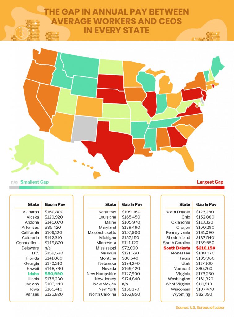
In general, we found that in the U.S., CEOs earn an average of $139,782 more annually than the average worker. As you can see in the above table, 28 states fall above that average and 21 states fall below.
In general, we found that in the U.S., CEOs earn an average of $139,782 more annually than the average worker. 28 states fall above that average and 21 states fall below.

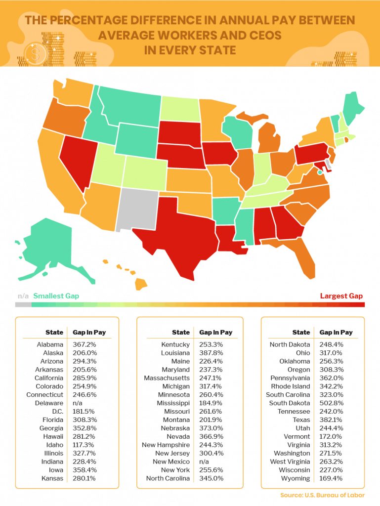
Starting with the national average, there is a 279.7% difference in pay between CEOs and average workers. As noted in the table above, 19 states have a gap in pay between CEOs and average workers of 300% or greater, with the greatest percentage difference being 502.8% in South Dakota.
Conclusion
It is staggering to see the dollar and percentage differences laid out state by state. With all of the changes and uncertainty the economy has seen and will continue to see as a result of the COVID-19 pandemic, it will be interesting to see how this potentially impacts executive pay at affected companies.
Scroll to very bottom of page & add your comments on this article. We want to share what you have to say!
Editor’s Note: The original article from Commodity.com has been edited ([ ]) and abridged (…) above for the sake of clarity and brevity to ensure a fast and easy. The author’s views and conclusions are unaltered and no personal comments have been included to maintain the integrity of the original article. Furthermore, the views, conclusions and any recommendations offered in this article are not to be construed as an endorsement of such by the editor. Also note that this complete paragraph must be included in any re-posting to avoid copyright infringement.
munKNEE.com has joined eResearch.com to provide you with individual company research articles and specific stock recommendations in addition to munKNEE’s more general informative articles on the economy, the markets, and gold, silver and cannabis investing.
Check out eResearch. If you like what you see then…
Related Articles from the munKNEE Vault:
1. Minimum Income Required To Be In the Top 50%, Top 10%, Top 1%, Etc.
This visualization charts the minimum income needed for each income percentile, from the top 50% to the top 0.001%.
2. 10% of U.S. Households Earn +$154,100/year; 2% Earn +$360,400/yr. – Where Does Your Income Put YOU? (+4K Views)
How does your household income compare on a percentage basis to others in the U.S.? Are you in the top 2%, 10%, 50%? This calculator shows you exactly where.
3. Are You In the American Middle Class? – Find Out With Our Income Calculator
The share of adults who are middle class varies widely across U.S. metropolitan areas. Our newly updated calculator lets you find out which group you fit in, first compared with other adults in your metro area and among American adults overall, and then compared with other adults in the U.S. similar to you in education, age, race or ethnicity, and marital status. Are you in the American middle class?
4. Share Of Income Earned By Top 1% In U.S., Canada, U.K., Germany & Japan From 1975 to 2015
The U.S. is surprisingly low in disposable household income and rather high in income inequality. [In fact,] it is not too much of a stretch to say that the U.S. is now divided into two nations, not entirely separate but increasingly unequal.
5. Income Inequality By Country + 49 Other Informative World Views (+22K Views)
If you’re a visual learner then you know maps, charts and infographics can really help bring data and information to life. Maps can make a point resonate with readers and this collection aims to do just that.


 munKNEE.com Your Key to Making Money
