This article takes a step back and looks at the bigger picture related to gold including long-term trends, and sets out some key characteristics of gold which are worth considering when (or if) allocating some part of an investment portfolio to the world’s favorite precious metal.
By Matthew Salter (http://int-markets.com) as originally posted on SeekingAlpha.com under the title* Gold: Some Interesting Graphs To Round Off 2014.
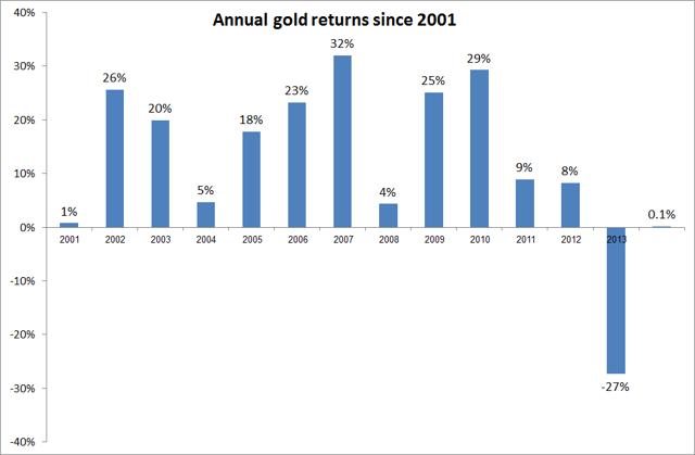
Graph number 1 – returns since the 2001 bull market
Th graph above shows quite clearly how the spectacular 12 year bull market of 2001-2012 came to a grinding halt in 2013 with losses of a magnitude not seen since over 30 years previously and, while there were fears that these losses would continue into 2014, the maximum loss seen during the year involved a loss of about 5% as gold traded below $1,150 in November. On the flip side gold also looked like it was reversing course as it surged towards $1,400 much earlier in the year, with gains of about 15%.
[Editor’s Note: The above statistics convey that:- during the 14 year period from 2000 to 2014 gold appreciated an average of 24.5% per annum on a compounded basis,
- for the past 10 years gold appreciated an average of 19.0% per annum on a compounded basis,
- for the past 7 years gold appreciated 6.3% per annum on a compounded basis, and
- for the past 5 years, in spite of the 27% decline in 2013, gold still appreciated albeit only 2.2% per annum on a compounded basis.]
In the end neither the bulls nor the bears could claim victory as gold closed out the year almost bang on $1,200, with a negligible change from a year previously.
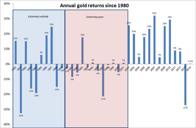
Graph number 2 – long term returns
The longer term picture of gold is very instructive for reminding the investor of how unusual the recent bull market in gold was when considered next to historical trends.
The years before 2001 can be characterized very approximately into 2 different and distinct time periods:
- a period of ‘extremely volatile returns’ (roughly corresponding to the 1980s) and
- a period of ‘extremely poor returns’ (roughly corresponding to the 1990s).
Being a gold investor at almost any period between 1980 and 2001 would have been a deeply unsatisfying experience. In fact, except for 1985-87, there was not a single time when gold saw positive returns in 2 consecutive years. Set alongside the returns of the recent decade, the contrast is quite dramatic and puts into question whether the bull run of the 2000s was an exception to the general trend of gold.
[Editor’s Note: The above statistics convey that gold appreciated:- an average of 6.8% per annum on a compounded basis over the past 35 years (1980 to 2014 gold),
- an average of 7.3% per annum on a compounded basis over the past 30 years,
- an average of 10.2% per annum on a compounded basis over the past 20 years,
- an average of 24.5% per annum on a compounded basis over the past 14 years,
- an average of 19.0% per annum on a compounded basis over the past 10 years,
- an average of 6.3% per annum on a compounded basis over the past 7 years, and
- an average of 2.2% per annum on a compounded basis, in spite of the 27% decline in 2013, over the past 5 years.]
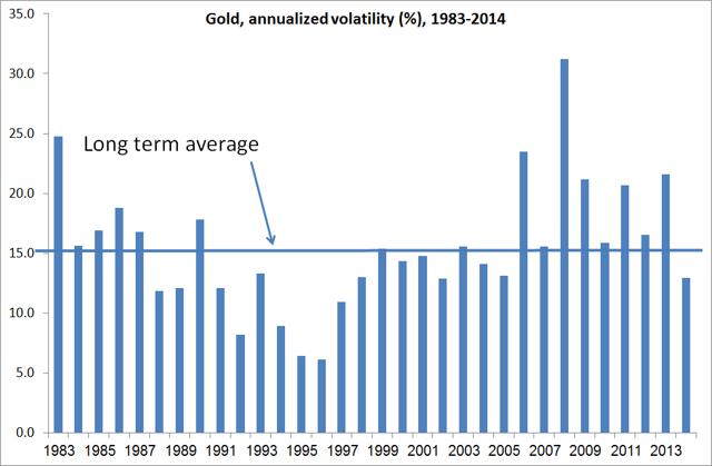
Graph 3 – volatility of gold
One reassuring aspect of gold in 2014 for investors was the fact that after several years of high volatility (compared to the historical average) the volatility of gold fell to lows not seen for about 10 years. The volatility of gold fell to just under 13%, following 8 consecutive years where volatility has been above the long term average of 15%.
Not into Facebook or Twitter? No problem. Subscribe (sample here) to our FREE “Market Intelligence Report” newsletter for access to every new article posted in the last day or two. It has an easy “unsubscribe” feature should you wish to do so at any time for any reason.
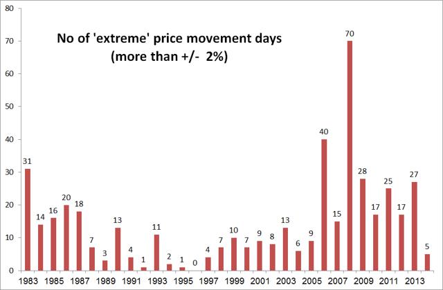
This may not sound like a big difference, but another way of looking at the volatility is to see how many individual days the closing gold price varied by more than 2% from the previous day’s close. This is perhaps a more tangible way of getting a feel for the volatility of an asset class for the retail investor…
Indeed as the above diagram shows, the number of ‘extreme’ days in 2014 was positively sedate with the number of days where gold moved by more than 2% numbering just 5 days. This was the lowest number of days in a single year for almost 20 years and made gold look dreadfully boring compared to the experience over the last 8 years or so.
Graph 4 – correlation with equities
One final thing interesting thing I look at is the correlation of gold with equities. While it is difficult to justify buying gold on a valuation basis (in my opinion) it has been argued that gold acts as a good diversifier in a portfolio, specifically providing ‘insurance’ in times of financial market stress…[as exemplified as follows:]
- In the financial crisis of 2008, when the S&P 500 lost a whopping 37%, gold eked out a gain of 4%.
- In 2002 the S&P 500 lost an impressive 22% and the safe haven of gold provided a comforting 26% return.
On the face of it, gold looks like it may have an important role to play in a diversified portfolio at times of financial market turbulence – but not so fast.
- In 2008, at perhaps the height of the financial crisis (in terms of shocks to the markets), the S&P 500 lost over 23% over the course of a three month period from August to October.
- Over the same three month period, gold lost over 12%.
Conclusion: despite the fact that over the whole of the 2008 calendar year gold managed to act as an insurance policy against equity losses, it had to sustain a bumpy (or possibly ineffective) ride in the short term.
The following graph plots the monthly returns of the S&P 500 against the monthly returns of gold, over the last 35 years.
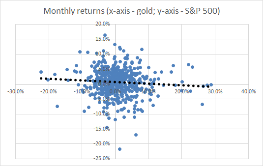
The trendline, shown in dotted black, is indeed negative as we would expect but the relationship is hardly a strong one. Indeed, the correlation of the monthly returns over the whole data set is only just negative…
Concluding comments
What does all the above mean for gold in 2015? Well, most major investment banks are forecasting ‘more of the same’ with the 2014 price action to continue…throughout 2015 in the $1,100 – $1,300 range…
[The above article is presented by Lorimer Wilson, editor of www.munKNEE.com and the FREE Market Intelligence Report newsletter (sample here) and may have been edited ([ ]), abridged (…) and/or reformatted (some sub-titles and bold/italics emphases) for the sake of clarity and brevity to ensure a fast and easy read. The author’s views and conclusions are unaltered and no personal comments have been included to maintain the integrity of the original article. This paragraph must be included in any article re-posting to avoid copyright infringement.]
*Original source: http://seekingalpha.com/article/2791255-gold-some-interesting-graphs-to-round-off-2014?ifp=0 (© 2015 Seeking Alpha)
Related Articles:
1. Gold & Silver Volatility & Diversification Myths Debunked
The commercial investment industry – from Wall Street to your personal financial advisor/planner – is more interested in milking its clients for fees and spreading lies, deception and propaganda than in actually acting to preserve and build their clients’ wealth. In my opinion, “safe diversification” and “less volatile” strategies are nothing but pure absolute rubbish invented by and regurgitated from the mouths of such consultants. Let me explain and show you some graphs to make my case. Words: 1680 Read More »
2. The Merits of Using Gold as a Portfolio Diversifier
Although not perfect (nothing is), gold has a tendency to go up in the face of external shocks…[and] tends to have a low and sometimes negative correlation to US equities. As such, with stocks up, gold being down is not a terrible outcome for the investor using gold as a diversifier. Let me explain further below. Read More »
3. Physical Gold and Gold Stocks Should be in Your Portfolio – Here’s Why
4. Don’t Laugh – Invest At Least 65% of Your Portfolio In Precious Metals!
There is such a “fear of gold” amongst most people that it must be due to statist indoctrination and propaganda because it makes no rational sense to have such a fear of such a time tested and true store of wealth. After all, we are talking about time tested and true money – the only money that has lasted for thousands of years and is still fully accepted worldwide as a store of wealth….What would you rather hold “for eternity” gold [or] US dollars [which are nothing more than] a paper debt obligation of a bankrupt nation state? Words: 450
5. Your Portfolio Isn’t Adequately Diversified Without 7-15% in Precious Metals – Here’s Why
The traditional view of portfolio management is that three asset classes, stocks, bonds and cash, are sufficient to achieve diversification. This view is, quite simply, wrong because over the past 10 years gold, silver and platinum have singularly outperformed virtually all major widely accepted investment indexes. Precious metals should be considered an independent asset class and an allocation to precious metals, as the most uncorrelated asset group, is essential for proper portfolio diversification. [Let me explain.] Words: 2137
6. It is Imperative to Invest in Physical Gold and/or Silver NOW – Here’s Why
Asset allocation is one of the most crucial aspects of building a diversified and sustainable portfolio that not only preserves and grows wealth, but also weathers the twists and turns that ever-changing market conditions can throw at it. However, while the average [financial] advisor or investor spends a great deal of time carefully analyzing and picking the right stocks or sectors, the basic and primary task of asset allocation is often overlooked. [According to research by both Wainwright Economics and Ibbotson Associates and the current Dow:gold ratio, allocating a portion of one’s portfolio to gold and/or silver and/or platinum is imperative to protect and grow one’s financial assets. Let me explain.] Words: 1060
7. Protect Your Portfolio By Including 15% Gold Bullion – Here’s Why
We are reading a lot of hype these days about gold and the necessity to own it but only about 2% of ‘investors’ actually have gold in their portfolios and those that have done so have insufficient quantities to offset the future impact of inflation and to maximize their portfolio returns. New research, however, has determined a specific percentage to accomplish such objectives. Words: 1063
8. Believe It or Not: Only 1 Fund Has Outperformed Physical Gold Since 2007!
Out of the 7,500 separate mutual funds available, and with 22,000 shares classes to choose from, only 1 fund – just ONE fund – actually managed to achieve a greater percentage return than gold bullion since the alarm bells rang out at the turn of 2007! [That being said, are you still one of the 99% of investors who, for whatever reason (are you foolishly listening to the “advice” provided by your stock broker/securities salesman going under the guise of a financial “advisor”), is still without any physical gold or silver?] Words: 395
9. Does What Happened in 2014 Refute, Or Just Delay, the Gold-bug Case?
12 short months ago, the immediate future looked like a lock yet 2014 turned out to be a pretty good year for the powers that be and the economic theories that animate their behavior. 2014 should not have happened, but it did, and now the sound money community is left trying to figure out what it missed and, crucially, whether what happened refutes the sound-money/gold-bug case, or simply delays it. This article has the answer. Read More »
10. Gold, Stocks & Bonds: What % Should You Have of Each?
What would the optimal portfolio allocation in gold have been according to Modern Portfolio Theory over several different periods of time? This article has a look at how an investor could have combined gold and equities to enhance risk-adjusted returns. Read More »
 munKNEE.com Your Key to Making Money
