I believe that the Silver to Gold Ratio has peaked, making silver a compelling bargain relative to gold. From today’s vantage point it is difficult believing that the price of silver could ever equal or exceed the price of gold but, when one considers the possibilities, there are many good reasons to accumulate as much silver as possible at today’s prices.
Read More »Silver Is THE “Achilles Heel” Of the Entire Financial System (+2K Views)
In my opinion the "final financial shot' which leads to live financial fire (collapse) will be in either the gold or silver pits of the COMEX or, ultimately, both. Why? Because, at $20 per silver ounce, it would take only $1.2 billion to crack that market open like a watermelon; because, for a pittance of money in today's world, "trust" in the entire financial system of the West can be shattered. Some will say "big deal" or "who cares?" but it is a big deal and YOU should care!
Read More »A Financial Train Wreck IS Coming & That’s When All Hell Breaks Loose! Here’s Why
A financial train wreck is coming! When does it hit the wall? The answer to that question is it's not very far down the road, and I can promise you that is when all hell is going to break loose. [Let me explain why that is the case.]
Read More »New Technology “Hype Cycle” Ideal to Assess Opportunities – Here’s Why (+3K Views)
For any retail investor looking at technology opportunities, identifying just where various technologies are in their respective development (how much work is still to be done to bring the ideas to fruition) and, as such, when each of them will become realities, is imperative. Our Hype Cycle graph does just that. Take a look.
Read More »Get Ahead of the Curve & Meet Generation Z
Move over Millennials, there’s already a newer generation businesses are interested in, and it’s called “Gen Z”. If you were not familiar with this new generation label, no one would blame you. Generation Z is currently under construction, with a vague birth range that starts in the mid-90’s to present day. This infographic provides some basics on Gen Z.
Read More »“Financial-tainment” Journalism: An Exposé
Many people have unwittingly bought into a highly addictive, sensationally-driven religion of doom-and-gloom where every day is a bad day, every war is a possible prelude to World War III, every market correction is a prelude to another financial crisis, every poor economic statistic is proof of a coming collapse. In theory, the above could all be true, and that's why framing any event in such a fashion is so tantalizing. Welcome to the doom-and-gloom "financial-tainment" industry!
Read More »How Much Investment Income Do You Need to Retire? Here Are Some Guidelines
Here's an interesting rule of thumb that most retirees and would-be retirees would do well to adopt.
Read More »What Does the “Market Map Model” Say About Future Direction Of U.S. Stocks, Interest Rates & Commodities?
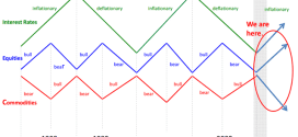
If the past long-term cyclical correlations between interest rates, equities, and commodities were to play out as they have done going back to the 1880s, U.S. stocks and interest rates should continue to rise as commodities either fall or underperform according to a 60-year cyclical pattern model referred to as The Market Map.
Read More »Effects of 2008 Recession STILL Affecting Majority of Americans – How About You?
The Fed has just released a 200 page study on the Economic Well-Being of U.S. Households in 2013 that reveals that 52% of the respondents to the survey said they did not have a mere $400 in savings for an unexpected emergency. That suggests to me that over half the county is on a paycheck-to-paycheck struggle. Below are my key findings from the survey presented in a concise easy to understand format.
Read More »A Close Look At the U.S. Dollar (+2K Views)
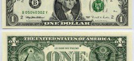
The U.S. $1 dollar bill has been redesigned many time since first being issued back in 1862. What we almost exclusively use today is the version designed in 1963. The following extremely informative infographic explains what all the different symbols on the dollar mean, who is on the front & back of all the U.S. currencies currently in use and the $500, $1,000, $10,000 and $100,000 (yes, $100,000!) bills that are no longer in production.
Read More » munKNEE.com Your Key to Making Money


