…The Congressional Budget Office has just published The Distribution of Household Income, 2019 (November 2022)…[in which] the underlying data behind the report is from income tax data…[that] is always a couple of years behind the times…The real strength of the report is not that it is up to the minute, but rather that it offers a snapshot in time along with useful sense of trends in income inequality since the late 1970s, when it began to rise. [Let’s take a look.]

By* Lorimer Wilson, Managing Editor of munKNEE.com – Your KEY to Making Money. Here’s why.
[Below]…is a snapshot of inequality across income levels for 2019.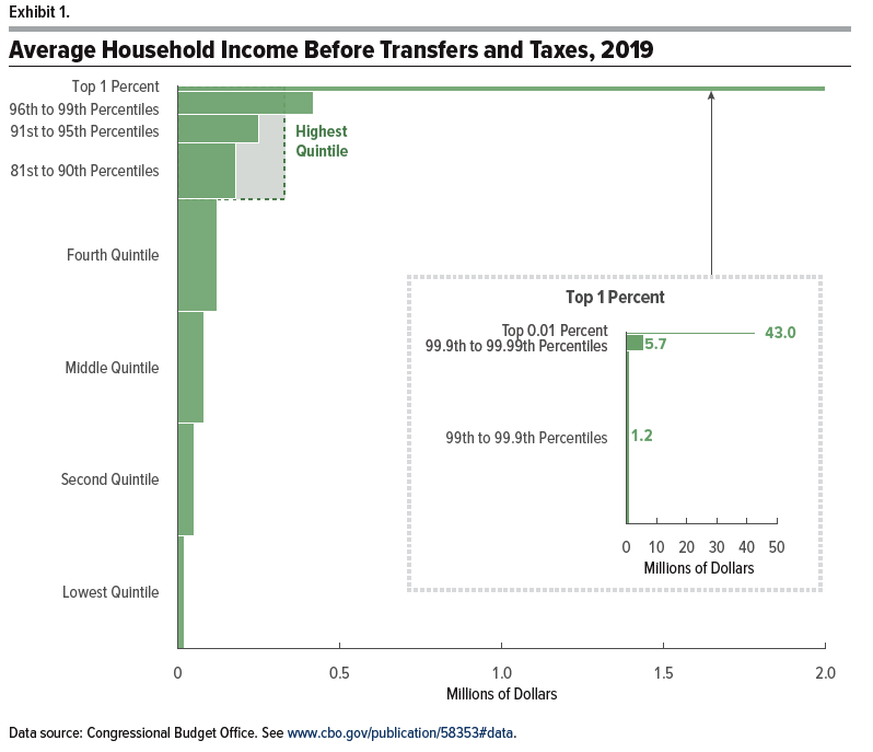
The breakout panel on the right shows that while average income for the top 1% was about $2 million, this breaks down into average income of $1.2 million for the 99 to 99.9th percent (that is, the top 1% not including the top 0.1%), average income of $5.7 million for the 99.9 to 99.99th percent (that is, the top 0.1%, not including the top 0.01%), and average income of $43 million for the top 0.01%.
The figure below shows where the income comes from for each group.

In particular, the black lines show that the highest share of income is from labor income–that is, being paid for work done in the previous year–for everyone up to the 99.9th percent. For the very tip-top, capital income and capital gains (think rising prices of assets like stocks and real estate) are the biggest share.
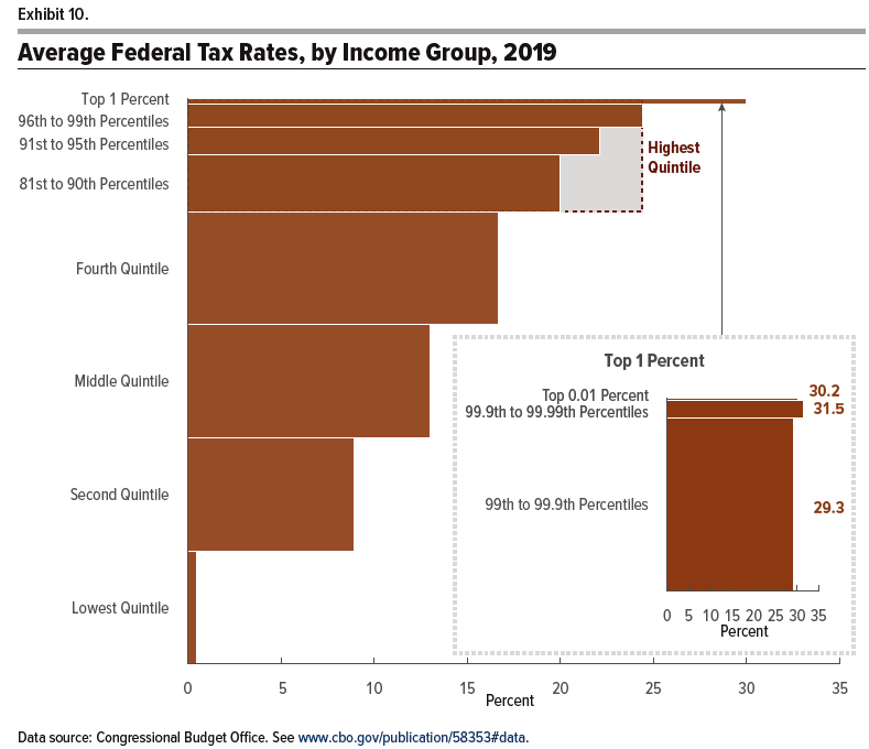
…[Below] is a figure showing average federal taxes by income group: this measure included all federal taxes (say, including payroll taxes for Social Security and Medicare), but does not include state and local income or sales taxes

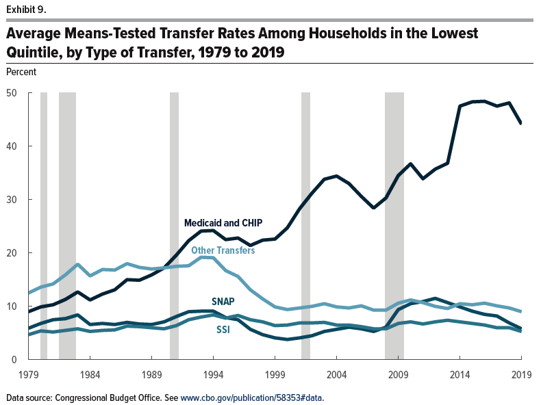
The figure [below] shows trends in what household in the lower quintile of the income distribution receive in federal redistribution programs. Notice that assistance in the form of Medicaid has risen substantially, but of course, Medicaid can’t be used to pay the rent or buy groceries. The other main transfers, food stamps (SNAP), Supplemental Security Income, and “other”, have been flat or trending down.
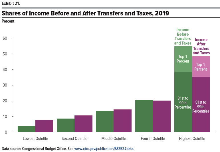
…How much redistribution happened in 2019? The…[figure below] shows the share of income for various groups before and after taxes and spending. The CBO writes: “The lowest quintile received 8 percent of income after transfers and taxes, compared with 4 percent of income before transfers and taxes… In contrast, the share of income after transfers and taxes for the highest quintile was about 6 percentage points less than the share of income before transfers and taxes. Because those households paid more in taxes than they received in transfers, the transfer and tax systems combined to reduce their share of income from 55 percent to 48 percent. Much of that decline was experienced by households in the top 1 percent of the distribution, whose share of income after transfers and taxes was 13 percent, 3 percentage points lower than their share of income before transfers and taxes.”
The Gini coefficient is a standard way of compressing the distribution of income into a single number. The Gini ranges from 0 to 1, where a Gini of 0 would imply a completely equal distribution of income, and a Gini of 1 would imply that a single person received all the income…[Below] is the Gini for the US income distribution over time. You’ll notice that the top line, income inequality based on market incomes, is rising over time. However, the bottom line, which is income inequality after taxes and transfers, shows a Gini that has been essentially flat since 2000. The Gini in 2019 is higher than most of the 1970s and 1980s, but it’s similar in 2019 to the peak years over those periods, like 1986.
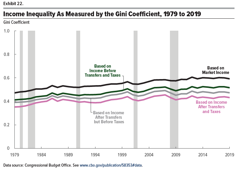
The overall pattern is that as market income has become more unequal,
- the forces of taxation and redistribution in pushing toward greater equality of after-tax,
- after-transfer income have become stronger over time, and since about 2000 those forces have broadly balanced each other out.
Of course, nothing in these numbers is an argument that the U.S. should not do more (or less) to redistribute but the factual claim that after-tax, after-transfer income inequality has been rising substantially over time is often overstated–and is not true for the last two decades.