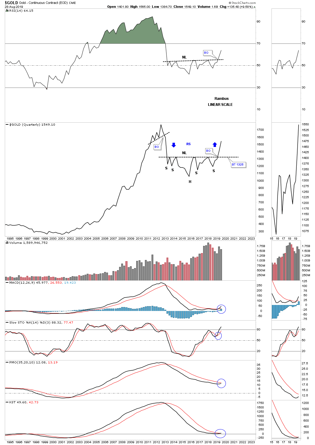
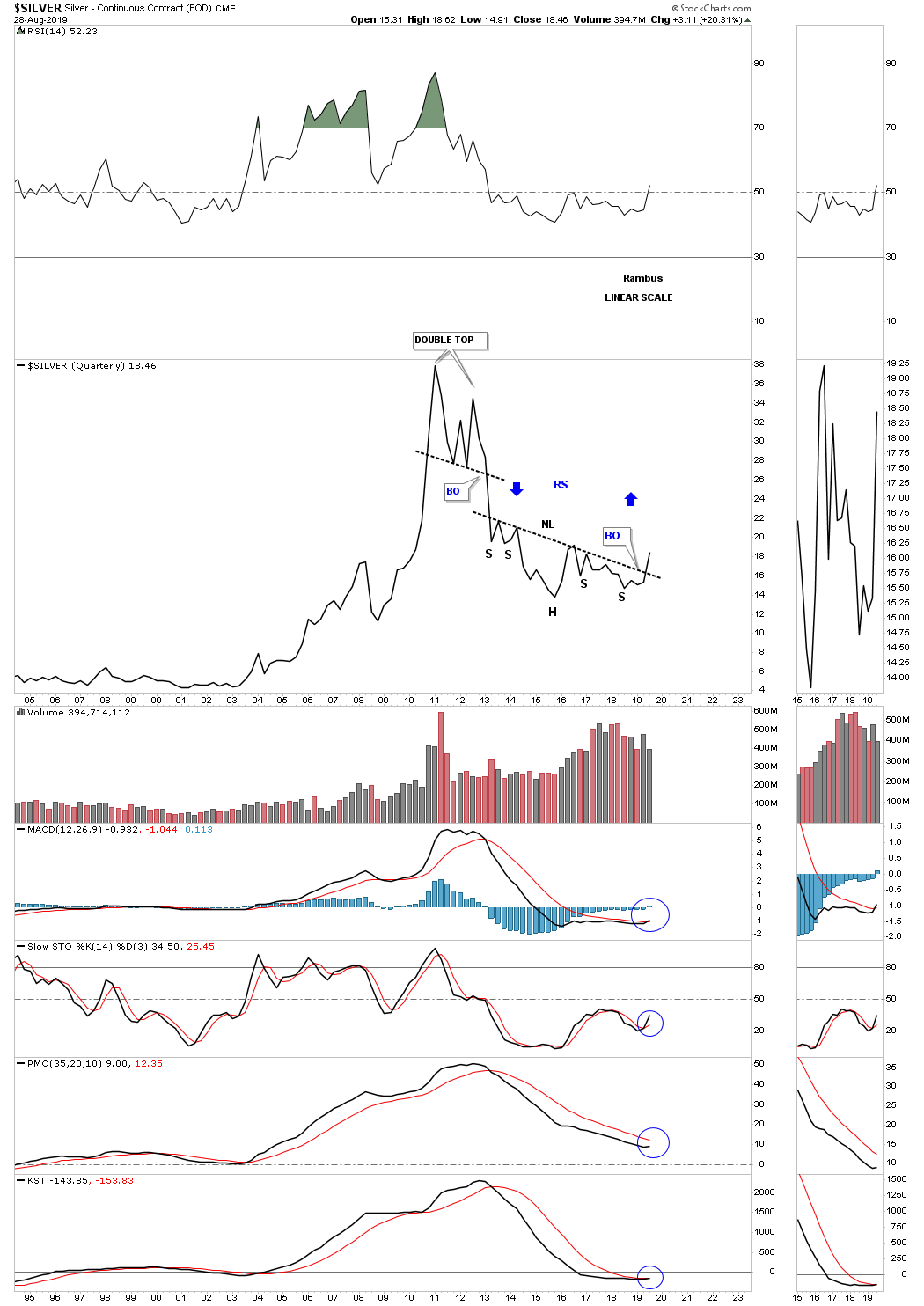
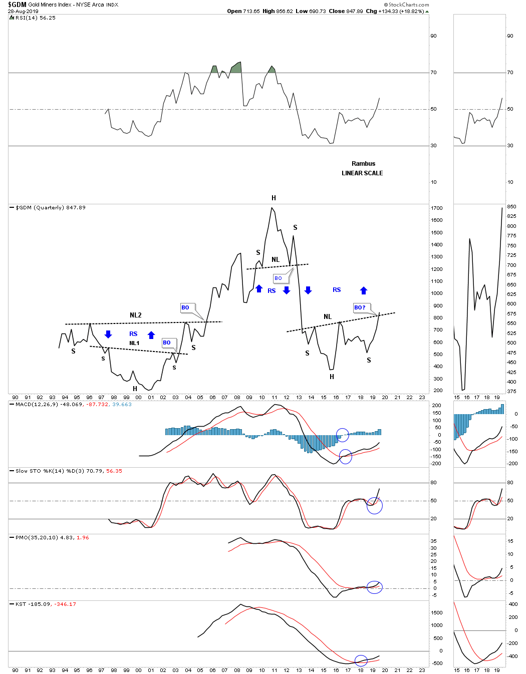
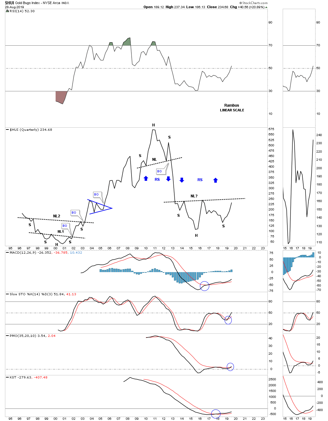
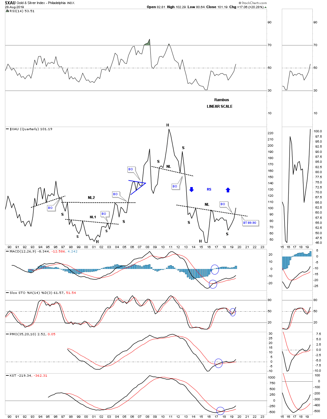
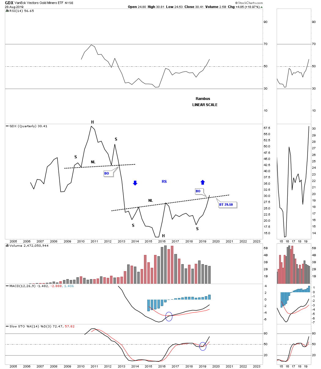
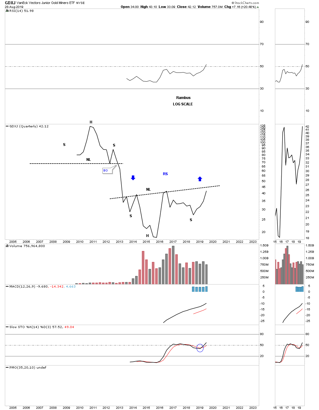
…There are still many investors that can’t believe the 2011 bear market is over…in the PM complex [but I show you below some super bases that will leave no question in your mind that the PM complex has indeed reversed course…to a new and long term bull market that will have many years to run. I know you are tired of me saying, “big patterns lead to big moves.” but the charts to follow will show you exactly what I mean by that statement.
…We are looking for big patterns that are well over 5 years in the making that show up at major reversal points from bull to bear or bear to bull markets [and] when you find a big pattern like I’m going to show you then you can be pretty confident of what the major trend is and invest accordingly.
Gold
…How a stock goes up is often how it comes back down over the same area and visa versa [and] you can see this very clearly on the quarterly line chart for gold below…I’m starting with the gold chart because it has been leading the rest of the PM complex higher and shows you what to expect with the rest of the PM complex when it becomes their turn to run higher.
Silver
Many PM investors are in awe of the run silver is having right now not knowing why…[and] the reason…is because it has just broken out of its massive H&S base…Look at how gold reversed symmetry up after breaking out from its H&S bottom. Silver is going to do the same thing and has already started.
The GDM Index
Next is the quarterly line chart for the GDM gold miners index, which has been around the second longest of all the PM stock indexes except for the XAU. Note the massive base which formed from the mid 1990’s to the early 2000’s which launched this PM stock index on its bull market run. As you can see it is now in the process of breaking out above its 2013 neckline. There appears to be some possible serious reverse symmetry just above the neckline.
The HUI Index
Below is the quarterly line chart for the HUI which is still trading below its 2013 H&S neckline. There is no doubt that the HUI will follow suit and break out from is super base. Again, note how the price action could very well reverse symmetry back up over the same area on the way down as shown by the blue arrows.
The XAU Index
Next up is the XAU gold and silver index which is breaking out from its 2013 H&S neckline. Again, note the super base on the left hand side of the chart which launched this PM stock index on its bull market that ended in 2011. What’s interesting is that the XAU actually retraced 100% of its 2000 to 2011 bull market because this index is made up of some silver stocks which were very weak during the bear market years.
The GDX ETF
The GDX has only been around since 2006 but has still produced 2 super patterns, the 2011 H&S top and the current 2013 H&S bottom. The price action is currently trying to breakout from the 2013 H&S neckline.
The GDXJ ETF
The GDXJ, a junior gold miners etf, has only been around for 10 years. When you compare this 2013 base to the GDX 2013 base you can see the juniors have been slightly under-performing the big cap PM stocks up to this point. At some point in the future we will see the juniors outperform the big caps in a big way once the speculative fever hits the PM complex.
The HGU.TO ETF
The HGU.TO Canadian gold miners ETF is set up a bit differently than the rest of the PM stock indexes we’ve looked at so far. It doesn’t have a lot of history but it does have enough to show a 3 year double bottom building out. A breakout above the double bottom trend line will complete the reversal pattern. To measure for a price objective just measure the distance of the double bottom and add it to the breakout of the double bottom trend line. Again, there could be some very nice reverse symmetry to the upside.
The SIL ETF
…This silver miners etf is breaking out from a bullish rising flag…[and] could be getting ready to play some catch up. This quarterly line chart really drives home just how weak this index is vs the rest of the PM stock indexes.
Conclusion
What all the charts above are strongly suggesting is that a breakout above any of the necklines is a very bullish setup and lays the groundwork for many more years of bull market price action. Big patterns lead to big moves.
 munKNEE.com Your Key to Making Money
