Is the Stock Market Cheap?
The Cyclically Adjusted Price Earnings Ratio, abbreviated as CAPE, or the more precise P/E10, closely tracks the real (inflation-adjusted) price of the S&P Composite. After dropping to 13.3 in March 2009, the P/E10 has rebounded to 23.0. The historical average is 16.39 raising concerns about the current price level of the S&P Composite. Let me explain. Words: 1298
So says Doug Short (www.dshort.com) in an article* which Lorimer Wilson, editor of www.munKNEE.com, has further edited ([ ]), abridged (…) and reformatted below for the sake of clarity and brevity to ensure a fast and easy read. (Please note that this paragraph must be included in any article re-posting to avoid copyright infringement.) Short goes on to say:
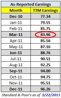
Here’s the latest update of my preferred market valuation method. It uses the most recent Standard & Poor’s “as reported” earnings and earnings estimates and the index monthly averages of daily closes for March 2011, which is 1,304.49. The ratios in parentheses use the March monthly close of 1325.83. For the latest earnings, see the table below from Standard & Poor’s.
The Valuation Thesis
 A standard way to investigate market valuation is to study the historic Price-to-Earnings (P/E) ratio using reported earnings for the trailing twelve months (TTM). Proponents of this approach ignore forward estimates because they are often based on wishful thinking, erroneous assumptions, and analyst bias.
TTM P/E Ratio
The “price” part of the P/E calculation is available in real time on TV and the Internet. The “earnings” part, however, is more difficult to find…The table here shows the TTM earnings based on “as reported” earnings along with a combination of “as reported” earnings and Standard & Poor’s estimates for “as reported” earnings for the next few quarters. The values for the months between are linear interpolations from the quarterly numbers.
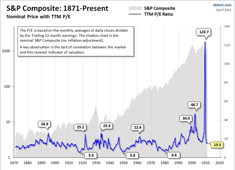
The average P/E ratio since the 1870’s has been about 15. The disconnect between price and TTM earnings during much of 2009 was so extreme that the P/E ratio was in triple digits — as high as the 120s — in the Spring of 2009. In 1999, a few months before the top of the Tech Bubble, the conventional P/E ratio hit 34. It peaked close to 47 two years after the market topped out.
As the above examples illustrate, in times of critical importance, the conventional P/E ratio often lags the index to the point of being useless as a value indicator. “Why the lag?” you may wonder. “How can the P/E be at a record high after the price has fallen so far?” The explanation is simple. Earnings fell faster than price. In fact, the negative earnings of 2008 Q4 (-$23.25) is something that has never happened before in the history of the S&P 500.
Let’s look at a chart to illustrate the unsuitability of the TTM P/E as a consistent indicator of market valuation.
Click to enlarge:
The P/E10 Ratio
Legendary economist and value investor Benjamin Graham noticed the same bizarre P/E behavior during the Roaring Twenties and subsequent market crash. Graham collaborated with David Dodd to devise a more accurate way to calculate the market’s value, which they discussed in their 1934 classic book, Security Analysis. They attributed the illogical P/E ratios to temporary and sometimes extreme fluctuations in the business cycle. Their solution was to divide the price by a multi-year average of earnings and suggested 5, 7 or 10-years.
Who in the world is currently reading this article along with you? Click here to find out.
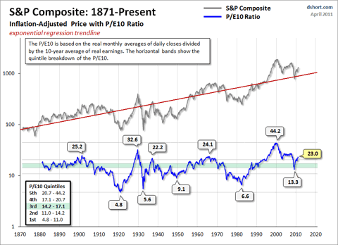
In recent years, Yale professor Robert Shiller, the author of Irrational Exuberance, has reintroduced the Graham/Dodd concept to a wider audience of investors and has selected 10 years as the earnings denominator. As the accompanying chart illustrates, this ratio closely tracks the real (inflation-adjusted) price of the S&P Composite. The historic average is 16.39. Shiller refers to this ratio as the Cyclically Adjusted Price Earnings Ratio, abbreviated as CAPE, or the more precise P/E10, which is my preferred abbreviation.
The Current P/E10
After dropping to 13.3 in March 2009, the P/E10 has rebounded to 23. The chart below gives us a historical context for these numbers. The ratio in this chart is doubly smoothed (10-year average of earnings and monthly averages of daily closing prices). Thus the fluctuations during the month aren’t especially relevant (e.g., the difference between the monthly average and monthly close P/E10).
Click to enlarge:
Of course, the historic P/E10 has never flat-lined on the average. On the contrary, over the long haul it swings dramatically between the over- and under-valued ranges. If we look at the major peaks and troughs in the P/E10, we see that the high during the Tech Bubble was the all-time high of 44.2 in December 1999. The 1929 high of 32.6 comes in at a distant second. The secular bottoms in 1921, 1932, 1942 and 1982 saw P/E10 ratios in the single digits.
Where does the current valuation put us?
For a more precise view of how today’s P/E10 relates to the past, our chart includes horizontal bands to divide the monthly valuations into quintiles — five groups, each with 20% of the total. Ratios in the top 20% suggest a highly overvalued market, the bottom 20% a highly undervalued market. What can we learn from this analysis? The Financial Crisis of 2008 triggered an accelerated decline toward value territory, with the ratio dropping to the upper second quintile in March 2009. The price rebound since the 2009 low pushed the ratio back into the top quintile. By this historic measure, the market is expensive.
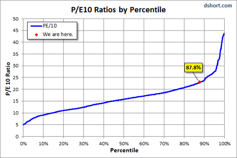
We can also use a percentile analysis to put today’s market valuation in the historical context. As the chart below illustrates, latest P/E10 ratio is approximately at the 88th percentile.
Click to enlarge:
A more cautionary observation is that every time the P/E10 has fallen from the top to the second quintile, it has ultimately declined to the first quintile and bottomed in single digits. Based on the latest 10-year earnings average, to reach a P/E10 in the high single digits would require an S&P 500 price decline below 540. Of course, a happier alternative would be for corporate earnings to make a strong and prolonged surge. When might we see the P/E10 bottom? These secular declines have ranged in length from over 19 years to as few as three. The current decline is now in its eleventh year. Was March 2009 the beginning of a secular bull market? Perhaps, but the history of market valuations suggests a cautious perspective.
Additional Perspectives on the P/E10
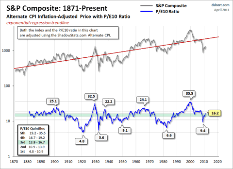
The real P/E10 based on the ShadowStats Alternate CPI for the inflation adjustment… suggests that the current market is fairly priced. (On a personal note, I find the Alternate CPI version of the P/E10 interesting, but I think it is unreliable for estimating market valuation. Government policy, interest rates, and business decisions in general have been fundamentally driven by the official BLS inflation data, not the alternate CPI.)
Click to enlarge:
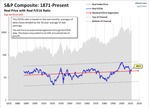
Another approach, and one which avoids the question of the “correct” inflation adjustment, is to use nominal values for calculating the cyclical P/E ratio. This is the method of analysis favored by Bob Bronson, a market historian whose research is occasionally featured here. Bronson favors a 16-year earnings cycle which corresponds more closely to the duration of broader market cycles… and I now include a monthly update of the nominal P/E16.
Click to enlarge:
*http://seekingalpha.com/article/261779-is-the-stock-market-cheap?source=email_the_macro_view
For more excellent articles by Short on the stock market please read:
https://munknee.com/2011/01/how-mean-will-the-sp-500s-future-regression-to-trend-be/
and for a different, and more optimistic, view of the markets read https://munknee.com/2011/04/counterpoint-equities-are-not-overvalued/
Editor’s Note:
- The above article consists of reformatted edited excerpts from the original for the sake of brevity, clarity and to ensure a fast and easy read. The author’s views and conclusions are unaltered.
- Permission to reprint in whole or in part is gladly granted, provided full credit is given as per paragraph 2 above.
- Sign up to receive every article posted via Twitter, Facebook, RSS feed or our FREE Weekly Newsletter.
P/E Ratio
 munKNEE.com Your Key to Making Money

