For all of its faults and flaws, the U.S. scores well in terms of paying its bills as it’s generally accepted that the U.S. government will never default on its loan obligations and so these four words – full faith and credit – have tremendous value…[Here’s] a REIT backed by the “full faith and credit” of the U.S. government – and yielding 5.8%.
 This edited version* of the original article, by Brad Thomas, has been edited here by munKNEE.com for length (…) – original article: 2091 words; this article: 728 words – and clarity ([ ]) to provide a fast & easy read.
…The U.S. government is the largest employer in the world – and the largest office tenant in the U.S. – so when you’re looking to invest in a REIT that is 100% focused on the U.S. government consider Easterly Government Properties (DEA). Easterly focuses on the acquisition, development and management of class A commercial properties that are leased to U.S. government agencies through the General Services Administration…[and] is now yielding 5.8%, one of the highest yields in the office sector.
AFFO projected for 2018 is $.87 per share and $1.00 per share in 2019. While this data is subjective, it does illustrate that the dividend is stressed, based on this earnings estimate. Easterly recently declared a dividend relating to Q3-18 operations of $0.26 per share (compared to FFO adjusted of $.24 per share).
…Since 2010, DEA has acquired 64 properties encompassing 5.5 million square feet, including 31 properties leased primarily to U.S. government service agencies….GSA-leased inventory has grown 24.0% since 1998 (as compared with an 8.1% decline for GSA-owned), and the GSA now rents more than it owns. Given recent federal budget constraints, it is likely that the U.S. government will continue to grow its leased portfolio of assets.
Easterly sticks to critical missions of the federal government that don’t go out of favor – agencies such as the Federal Bureau of Investigation and the Immigration and Customs Enforcement.
Source: DEA Investor Presentation
Easterly only deals with the U.S. federal government, and the REIT does not have an interest in working with any other government, state or local, because these are not backed by the “full faith and credit” of the United States…Its portfolio is 100% leased, the weighted average age is 13.5 years…[and] is around 97% backed by the U.S. government. The GSA has never financially defaulted on a lease throughout its history, and because Easterly does not lease to state agencies, there are no risks related to appropriations…
I have been touting Easterly since July, 2015 for quite some time… Since that time, however, shares have declined by over 12%. In fact, DEA is now trading at the lowest price ($17.52) in over three years.
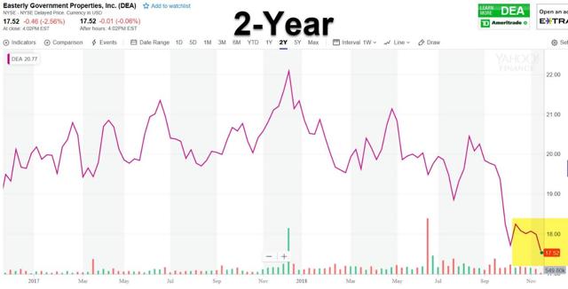
Source: Yahoo Finance
We believe that much of the recent pullback in share price has to do with Easterly’s payout ratio and cash available for distribution. Here’s how management explains:
“In 2019 specifically revenue and thus FFO per share on a fully diluted basis faces a non-cash head wind of $2.5 million related to the cessation or completion of the amortization of lease related assets and liabilities. This $2.5 million will negatively impact our year-over-year FFO comparison it has no bearing on the company’s distributable cash flow, the metric upon which as management we are mostly highly focused.
Additionally, weighted average shares outstanding on a fully diluted basis since 2019, will include approximately 1 million units that are the result of long-term incentive plan grants that were made at the time of IPO.
In combination, these two factors diminish our 2019 FFO guidance by approximately $0.045 per share. Pro forma for these two factors, the midpoint of 2019 guidance represents year-over-year FFO per share growth from the midpoint of our 2018 guidance of 3.5%.”
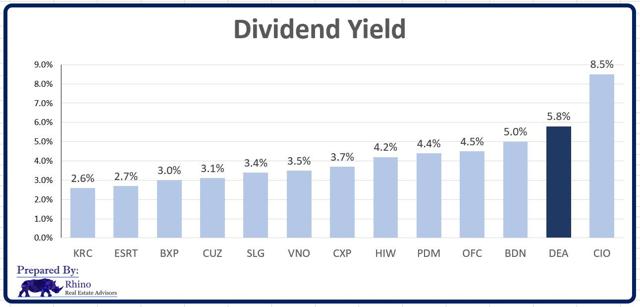
As noted above, Easterly now sports one of the highest dividend yields in the office sector (5.8%). Here’s how the P/FFO compares with other entities:
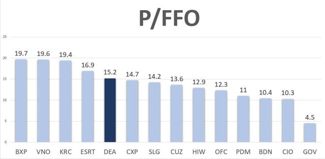
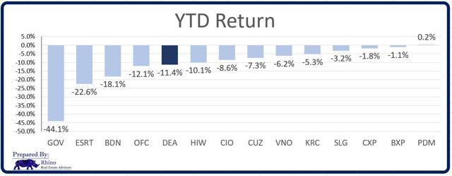
Source: Rhino Real Estate Advisors
Here’s how Easterly has performed year-to-date:
…Easterly is attempting to gain scale (reduce G&A) while growing its dividend. That’s not an easy task, especially when the company is internally-managed, but I am betting on management to deliver! Here’s our FFO-per-share estimate for 2020 (using FAST Graphs data and our DEA estimate).
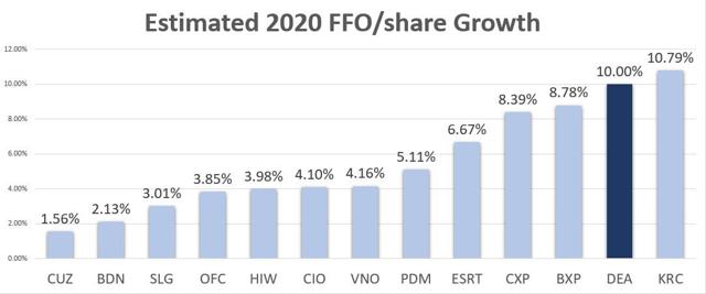
Source: Rhino Real Estate Advisors
In closing:
Investors should consider the risks related to Easterly:
- high payout ratio,
- size, and
- retention,
however,
- we believe that investors are being adequately rewarded for the risk in the form of a 5.8% dividend yield,
- there is strong shareholder alignment (senior management owns approximately 11.5% of shares)
- and who doesn’t like a REIT backed by the “full faith and credit” of the U.S. government!
[Editor’s Note: The author is receiving compensation from Seeking Alpha for pageviews of his original unedited article (2091 words compared to just 728 words in this edited version) as posted there so please refer to it for more details]
Want your very own financial site? #munKNEE.com is being given away – Check it out!
(*The author’s views and conclusions are unaltered and no personal comments have been included to maintain the integrity of the original article. Furthermore, the views, conclusions and any recommendations offered in this article are not to be construed as an endorsement of such by the editor)
For the latest – and most informative – financial articles sign up (in the top right corner) for your FREE bi-weekly Market Intelligence Report newsletter (see sample here).
Thank you for taking the time to read this article. If you enjoyed reading it please hit the “Like” button, and if you’d like to be notified of future articles, hit that “Follow” link