“Follow the munKNEE” via twitter & Facebook
The fact that nobody knows with absolute certainty where gold will go from today onward causes people try to make their own guesses about what can happen with the yellow metal. One of the methods to do that is to look back into past situations and try to estimate if what is happening now is somehow similar to those past events.
The situation in the gold market today is different than the one in 1980 in a few important areas. Even if past patterns don’t give you any certainty, though, sometimes they can limit the uncertainty. Let us analyze that in more detail. Words: 1260; Charts: 2
So writes Przemyslaw Radomski, CFA (www.sunshineprofits.com/) in edited excerpts from his original article* posted on Seeking Alpha entitled 1980 Top In Gold As A Reference Point For Precious Metals Investors.
This article is presented by www.FinancialArticleSummariesToday.com (A site for sore eyes and inquisitive minds) and www.munKNEE.com (Your Key to Making Money!) and may have been edited ([ ]), abridged (…) and/or reformatted (some sub-titles and bold/italics emphases) for the sake of clarity and brevity to ensure a fast and easy read. The author’s views and conclusions are unaltered and no personal comments have been included to maintain the integrity of the original article. Please note that this paragraph must be included in any article re-posting to avoid copyright infringement.
Radomski goes on to say, in part:
What happens now can be similar to what has happened before….It may be possible that some patterns repeat themselves. The same goes for everything that’s happening with gold….
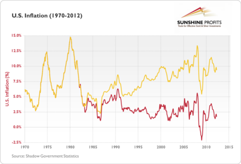
The chart below presents U.S. inflation figures.
The red line represents official inflation data as published by the Bureau of Labor Statistics. The gold line represents the inflation data calculated according to the methodology used in 1980. There is visible divergence between the two lines after 1980, and particularly after 1985.
The 1977-80 Bull Market in Gold
The annual inflation rate went up from 5.2% in January 1977 to 14.8% in March 1980. This rise was partially due to the deteriorating political situation in Iran, one of the OPEC nations. In early 1979, Iran saw a revolution that resulted in political power being shifted from the Shah of Iran to a religious leader, Ruhollah Khomeini. In the wake of the revolution, oil exports fell, curtailing global supply and driving prices of oil higher which, in turn, fueled the rise in prices of many other goods.
This is, however, only part of the story. OPEC countries increased oil supply to compensate for shortages, but the oil crisis was exacerbated by an embargo on Iranian oil imposed by U.S. President Jimmy Carter following an incident in the U.S. Embassy in Teheran, where more than 60 U.S. citizens had been taken hostage. With the embargo in place and public panic about the availability of oil, buyers rushed to acquire oil while they could. Increased demand caused even further increases in prices, and so the cycle continued. This is quite important, as it shows that the effects of adverse events can be worsened by crowd behavior.
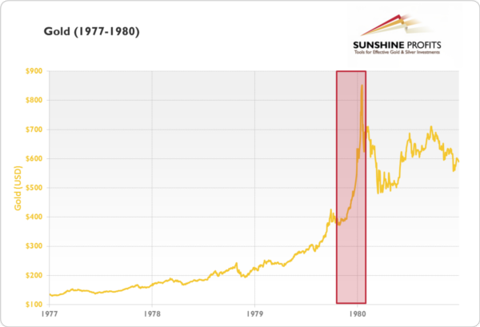
From January 4, 1977 to January 21, 1980, the price of gold rose from $135.70 to $850 (526.4%), partially fueled by soaring inflation. Let’s take a closer look at this bull market.
The Major Move in Gold Between December 3rd, 1979 & January 21, 1980
It is particularly worth noting that even though the bull market had started long before 1980, the most significant appreciation (in dollar terms) occurred in December 1979 and January 1980, when prices went up from $428.25 (December 3, 1979) to $850 (January 21, 1980)….The very end of the bull market saw the most significant appreciation in the yellow metal, and that the price of gold followed a path of”exponential” growth during this period. This period of exponential growth was partially triggered by the fact that:
- On December 24,1979, the Soviet army invaded Afghanistan, starting what would escalate to a 10-year-long war.
- Combined with the above-mentioned second oil crisis and soaring inflation in the U.S., the above event sent commodity prices sky high.
- Inflation…[also was] decisive in triggering the final rally, but it was emotional reasons that made investors and speculators rush for gold and amplified the price moves.
Once the panic about inflation and the war in Afghanistan was over, gold retraced back to as low as $485.25 as soon as March 27, 1980 so the craze started in December the previous year, and lasted for only about four months. This relatively short period seems to be defining how people perceive the 1980 bull market now.
A Comparison Between 1980 and the Current Bull Market in Gold
- Back in 1980, official inflation numbers were two-digit, while today, they stand at approximately 0% (official data) or 4-10% (inflation calculated according to methodologies that were in place in 1980 or 1990).
- In 1980, the scare of the Soviet war in Afghanistan was an important factor. Today, the situation in Iraq has been getting less and less attention, particularly since the U.S. withdrew its military personnel from the country in December 2011.
A comparison of the two periods shows that…the situation today is, in fact, very different than it was in 1980 so why do we even use the 1980 top in comparisons?
- Even though we don’t see inflation eating away at our pockets, it doesn’t necessarily imply that the uncertainty about the economy is limited. Right now, with unemployment at 7.7% and with a debt pile larger than GDP and growing, the U.S. economy doesn’t look deprived of uncertainty. To pay off such amounts of debt, the economy either needs to start growing, or the government can inflate the debt away so, even though the inflation as seen in 1980 is definitely not present, it is at least possible (and in our opinion — likely) that it will materialize in the future.
- If the economic situation suddenly deteriorates, we could experience effects similar to the ones seen in 1980 due to the Soviet war in Afghanistan (unlikely, but possible). Even if financial turmoil brought gold temporarily lower, as in 2008, it seems conceivable that such an event would be followed by strong appreciation of both gold and silver.
- Probably most importantly, even if we don’t see considerable inflation or the deterioration of the dollar, we still seem to be in a long-term bull market. This bull market can continue to unfold as in the last decade — quite differently than the 1977-80 appreciation in gold — but human emotions haven’t changed that much since 1980 so, in the third phase of the bull market when everybody would want to own gold, we might see a similar “exponential” price growth pattern. Actually, the events could play out a lot quicker than they did in 1980.
- While the 1980 top serves as a reference point, right now the audience that might want to take interest in precious metals is a lot broader than it was back in 1980….There is no Iron Curtain to prevent people from Central and Eastern Europe from taking part in the bull market. China and India are developing, and investors from these countries may fuel the bull market as well.
- What is more, right now, it’s a lot easier to manage your money than in was in 1980. Taking or reversing your positions in gold is a matter of seconds and minutes, not hours or days. Because of that, it is possible for any rally in the end stage of the bull market to be even more pronounced than it was in 1980.
Conclusion
To sum up, we use the 1980 top for comparisons not because the current economic situation is very similar to the one in 1979-80. In fact, it’s very different in some crucial areas, but the key point is the same — the fundamental situation was positive for gold in the 1970s, and that is the case right now.
We use [the 1980 top for comparison purposes] because it seems that human nature and emotionality hasn’t really changed since 1980. We still can see a period of “crazy buying” at the end of the bull market. What has changed, though, is the number of people that can participate in the bull market and the technological infrastructure.
Because of the above, the 1980 top can only be used as a general reference point, and not as a precise target. The changes in the markets may make the final rally of this bull market significantly more volatile than it was in 1980.
Sign up HERE to receive munKNEE.com’s unique newsletter, Your Daily Intelligence Report
- FREE
- The “best of the best” financial, economic and investment articles to be found on the internet
- An “edited excerpts” format to provide brevity & clarity to ensure a fast & easy read
- Don’t waste time searching for articles worth reading. We do it for you!
- Sign up HERE and begin receiving your newsletter starting tomorrow
- You can also “follow the munKNEE” via twitter & Facebook
*http://seekingalpha.com/article/1088831-1980-top-in-gold-as-a-reference-point-for-precious-metals-investors
Related Articles:
The timing of this article may seem incongruous given the current weak performance of gold and gold stocks but that was the identical situation in each of the past manias – both the metal and the equities didn’t excel until the frenzy kicked in. The following documentation (exact returns from specific companies during this era are identified) is actually a fresh reminder of why we think you should hold on to your positions – or start accumulating them, if you haven’t already. (Words: 1987; Tables: 7)
Our subscription service provides detailed technical analysis of where the price of gold, silver and precious metal stocks are going short term (in the next week or two), intermediate term (within the next 3-6 months) and long term (the ultimate top) in each stage of their respective bull runs. This service comes with detailed charting based on conventional technical analysis and our proprietary fractal analysis based on the ’70s. Below are some of our latest comments and rationale for expected price movements in gold without illustative charts which are only available to subscribers. Words: 1000
 munKNEE.com Your Key to Making Money


Another point that this article makes for me is that those using these Gov’t. generated numbers to plot charts are being “lead” (by those changing the way these numbers are calculated) to make assumptions (and we all know what that means when anyone assumes) that are in the big picture erroneous! In fact, I would go so far to say and I have no proof except for a gut feeling, that these Government numbers are calculated with the above in mind, in order to maintain the status quo…
I would like to see several flavors of the same chart posted! One with the current “approved” numbers and another one that illustrates what the same chart would look like if the “older” methods of calculations were applied to the entire chart instead of just the past portion of the chart (similar to the RED and Gold lines in the U.S. inflation chart above!
My gut predicts that those two versions of the chart would produce an entirely new way of plotting our future for all of US, which would making much easier to understand what is actually happening now that things are getting “more fiscally complicated”.
Happy New Year’s Day…