This article compares the 2012 year-end price forecasts for the S&P 500 from leading research sources with where the index is today, what various statistically generated price probabilities say about the year-end price [and, as such, how we plan to allocate our assets in the interim.] Words: 1445
So says Richard Shaw (http://www.qvmgroup.com/) in edited excerpts from a posting* on Seeking Alpha entitled Compare Early 2012 S&P 500 Forecasts With Current Market And Statistical Indicators.
Lorimer Wilson, editor of www.munKNEE.com (Your Key to Making Money!), may have edited the article below to some degree for length and clarity – see Editor’s Note at the bottom of the page for details. This paragraph must be included in any article re-posting to avoid copyright infringement.
Shaw goes on to say, in part:
On December 27, 2011 “Business Insider” published analyst forecasts, as follows:
- Morgan Stanley: 1167
- Goldman Sachs: 1250
- UBS: 1325
- Barclays: 1330
- Credit Suisse: 1340
- Bank of America: 1350
- Black Rock 1350
- Wells Fargo: 1360
- Citi: 1375
- Cumberland Advisors: 1350-1400
- Nomura: 1400
- Oppenheimer: 1400
- Blackstone: 1400
- Goldman Asset Management: 1400
- S&P Capital IQ: 1400
- JP Morgan: 1430
- Federated Investors: 1450
- Deutsche Bank: 1500
- Seabreeze Partners: 1527
- Median: 1350 – 1400
This morning the S&P 500 is at about 1388. Not a bad forecast so far for most of the analysts.
Who in the world is currently reading this article along with you? Click here
Let’s see what statistical models say about the probability range of price by year-end.
Figure 1: Linear Regression Best Fit Trendlines
This chart plots the linear regression best fit trend lines from the 2007 market high, the 2009 market low, and from 1 year ago, and extends those lines to 12/31 (lines plotted in blue).
Those three trendlines define a range of year-end values from 1300 to 1470 – very much in accord with the bulk of the analyst forecasts made in December 2011.
The red line plots bear market levels 20% below the 52-week high, and the gold line plots the 200-day moving average.
(click to enlarge)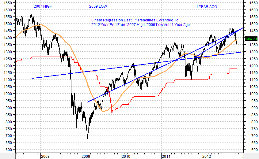
Figure 2: Regression Trend Lines With 1.28 Std. Dev. Channels
This chart plots the same linear regression trend lines in Figure 1, but also adds a channel above and below the regression trend at 1.28 standard deviations. That defines (based on historical volatility) the price range that covers 80% of the probable prices (basically a 10% chance of the price lying above the channel, or 10% chance of the price lying below the channel).
From the 2007 high, the range is 1530 to 1060. From the 2009 low, the range is 1660 to 1260. From 1 year ago, the range is 1550 to 1375.
As we will see when we look at options indication, only the 1375 value has a significant chance of being achieved by year-end.
(click to enlarge)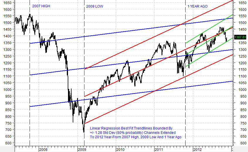
Figure 3: Volatility-Based Price Probability Ranges
This chart plots two price range probability cones at the 80% level — meaning that there is a 20% chance of the price occurring outside of the cones (roughly 10% above and 10% below).
The red cone is based on the current VIX level of about 15, and predicts the 80% range high at 1480 and the low at 1300. VIX is based on options pricing and is forward looking.
The blue cone is based on the 1-year actual historical volatility of the index; and is therefore backward looking in its rationale. Its 80% price probability high is 1455 and its low is 1320.
These values support the year-end forecasts made by all the listed analysts except Morgan Stanley and Goldman Sachs, which are below the cones; and Deutsche Bank and Seabreeze Partners, which are above the cones.
(click to enlarge)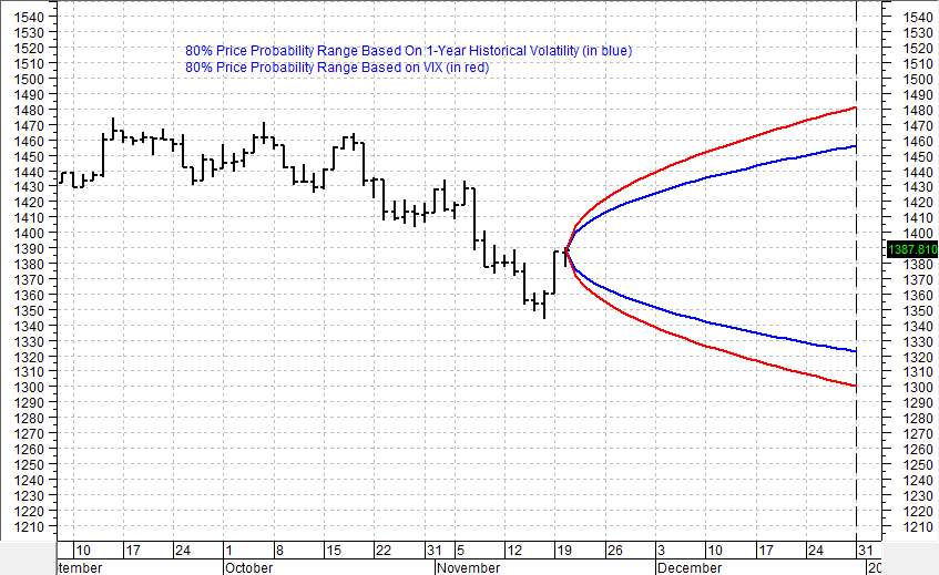
(Why Bother With Statistical Forecasts At All? When we have written about probability ranges in the past, there is always someone who says the exercise is completely pointless, because there is no specific price forecast, or that the range is too wide. Clearly, this approach is useless to them, but it is fundamental to options trading, and helpful to stock investors who want some level of indication where boundaries of play may be in a near-term period. The cones and other statistically derived ranges do not tell you where the price will be, but they can be helpful in telling you where they are likely not to be. That can help temper excess enthusiasm or excess pessimism.)
Figure 4: Spread of Recently Stated 2012 Forecasts
This 1-year price chart shows horizontal lines at the recently stated year-end price forecast levels by Deutsche Bank (green line), UBS and Barclays (blue line) and Goldman Sachs (red line).
Goldman has said they expect some unpleasant fiscal cliff outcomes in the short-term that supports their pessimistic price forecast. They do, however, predict a price above 1500 for year-end 2013.
(click to enlarge)
Figure 5: Statistical and Analyst Year-End Prices Versus Options Implied Probabilities
This chart plots all of the statistical price indications from earlier figures, plus the recently stated price targets from Deutsche Bank, UBS, Barclays and Goldman Sachs.
It also shows the probability of each of the price levels being exceeded on either the upside or downside according to the pricing within December 2012 SPX options (probabilities from OptionsExpress).
The 90% options implied probability range is 1480 to 1300. The linear regression trend line from the 2009 low, and the regression trendline from 1 year ago, each extending to 1470, fit into that 1480 to 1300 range, as does the 1300 for the regression trendline from the 2007 high.
According to options pricing, the 1250 Goldman Sachs forecast has less than a 1% chance of coming true. That doesn’t make them wrong, but it does mean that options traders don’t believe the scenario.
(click to enlarge)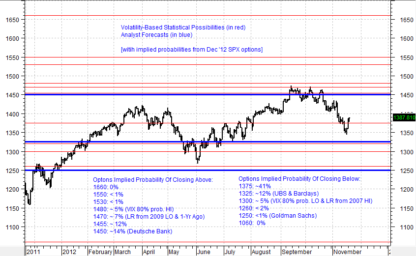
Figure 6: Extra-Long Term Regression Trendlines
Perhaps just for fun, let’s look at a 30-year monthly chart of the S&P 500, and plot a best fit regression trend line to that. Let’s also plot another regression trend line from 1994, when the character of the market changed, in great part, we think, because that was the year the internet became commercial (the year that HTML and pictures rolled out on the web).
What we find is the 30-year regression trend line extends to 2012 year-end at about 1500, and the regression trendline extends to year-end at about 1405. Very close fit with intermediate-term and short-term trendlines in earlier figures.
(click to enlarge)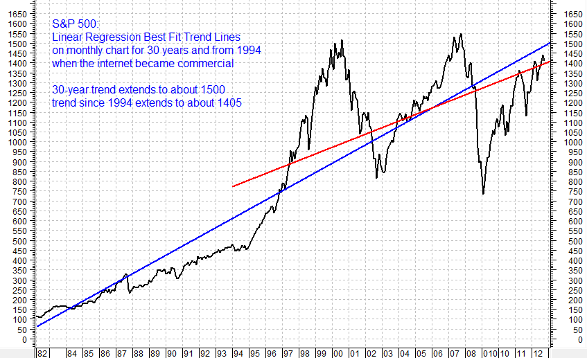
It is obvious from the picture that the character of the market changed around 1994. If Jeremy Grantham of GMO is correct, the character is changing again (for the worse). That is not really hard to believe given the mess we and the rest of the developed world are in….
Coming Full Circle:
When analyst forecasts align well with historical volatility generated forecasts and options implied forecasts, there may be the basis for taking some comfort in the reliability of the forecasts most of the time — but not if there are important events that change everything….[such as]:
- whether the US Congress and President allow the country to go over the cliff or not (a front row issue),
- the European debt crisis,
- potential for wider war in the Middle East and
- the possibility of military confrontation between China and Japan over resource rich areas of the ocean.
One really big upside surprise would be some indication of approvals and regulations that expand the oil and gas sector and associated jobs within the US. Something as simple as approving the Keystone pipeline could do the trick for the stock market.
In the US, we would hope that the people and the media will be as focused on the cliff decision as they are on the fate of Hostess Twinkies and Cupcakes, and the sexual behavior of generals and temptresses.
Sign up HERE to receive munKNEE.com’s unique newsletter, Your Daily Intelligence Report
- It’s FREE
- It contains the “best of the best” financial, economic and investment articles to be found on the internet
- It’s presented in an “edited excerpts” format to provide brevity & clarity of content to ensure a fast & easy read
- Don’t waste time searching for articles worth reading. We do it for you and bring them to you each day!
- Sign up HERE and begin receiving your newsletter starting tomorrow
Our Best Guess:
Taking the three data sources into consideration (analyst forecasts, historical price behavior, and options implied probabilities), and adding our own sense of the political overlay on the markets, this is our own best guess as to what we expect at a high probability:
- we will go over the cliff for a very short period of hours or days, so that each party can blame the other for the problem.
- they will then quickly reverse the cliff retroactive to January 1 and defer the deadline out a few months so that they can consider further and perhaps even make some nominal change to “prove” that they are serious.
The result of going over the cliff, or just seeming about to happen, is as follows:
- push the price level of the S&P 500 index toward the lower end of the predicted ranges, such as the low 1300s and maybe high 1200s.
- rally back to about 1400, in a sigh of relief, when they reverse the cliff and defer the deadline.
- ta big rally above 1500 is quite feasible IF they actually did something that put the US on a believable slope to fiscal sanity.
Conclusion
As a result we have an above normal cash level — not out of stocks or bonds, but a somewhat reduced stocks level.
- If we are right, we will re-enter at a lower price, and for taxable accounts will have captured some profits at lower tax rates (almost all of our clients are at the top marginal rates).
- If we are wrong, we will probably miss some upside before getting back in, but will have avoided a potentially damaging market slide, and the angst that would cause.
- Regardless, we have not bet the farm either way – just tilted the table in favor of conservatism.
*http://seekingalpha.com/article/1024101-compare-early-2012-s-p-500-forecasts-with-current-market-and-statistical-indicators
Editor’s Note: The above post may have been edited ([ ]), abridged (…), and reformatted (including the title, some sub-titles and bold/italics emphases) for the sake of clarity and brevity to ensure a fast and easy read. The article’s views and conclusions are unaltered and no personal comments have been included to maintain the integrity of the original article.
Related Articles:

The NYSE Composite and Wilshire 5000 index COULD BE forming one of the largest “Bearish Head & Shoulders” patterns in the past 100 years and IF they, in fact, are then we are about to see a 40% decline in those indices and the S&P 500 would most certainly follow suit. Take a look at the charts that tell the story. Words: 200
2. Goldman Sachs: The Fiscal Cliff Is a Real & Present Danger to Future Level of S&P 500 – Here’s Why

“Portfolio managers have been swayed by hope over experience” when it comes to anticipating the effects the fiscal cliff will have on markets. Investors aren’t giving as much attention to the fiscal cliff as they should be, and that may be helping to set the markets up for a repeat of last year, when the debt ceiling negotiations sent stocks plummeting.
3. These 6 Factors Suggest Avoiding Equities in the Foreseeable Future

The six factors discussed in this article suggest a near-term peak for equity markets, avoiding fresh exposure to equities at these levels and selling some of one’s equity holdings. Long-term investors can still ignore the volatility and buy quality stocks, however, it would make more sense to buy the same stocks after the markets decline 10%-15% than buying it at current levels. [Let me explain more fully.] Words: 665
4. Consumer Discretionary Stock Performance Key to Market Direction – Here’s Why

Renewed leadership by the sectors that stand to benefit most from a stronger economy and profit growth down the road…could be one of the best indications that perhaps the worst is indeed behind us and the rally has more room to run. However, if these cyclical sectors fail to participate more fully, that would be a signal of more potential trouble ahead. [Let me explain.] Words: 840
5. Don’t Ignore This Fact: “Greedometer Gauge” Signals S&P 500 Drop to the 500s by July-August, 2013!

The S&P500 is likely to achieve a secular (long term) peak this month, then drop to the 500s by July-August 2013. This article explains why. Words: 180
6. Current Market Overvaluation (from 33% – 51%!) Suggests Cautious Long-term Outlook

Based on the latest S&P 500 monthly data, [my analyses indicate that] the market is overvalued somewhere in the range of 33% to 51%, depending on which of 4 indicators I used. This is an increase over the previous month’s 31% to 48% range. [Let me explain the details.] Words: 475