Serious investors should make a habit of watching key ratios related to gold. They all suggest that it is still a great opportunity to buy gold & silver and/or their miners. Words: 958; Charts: 20
An original article by Lorimer Wilson, editor of munKNEE.com – Your KEY To Making Money!
Here are a number of reasons why it’s a good time to take advantage of this opportunity. One of the best indicators for knowing when it’s a low-risk time to buy gold stocks is the gold/silver ratio.
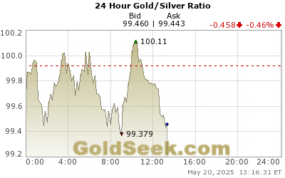
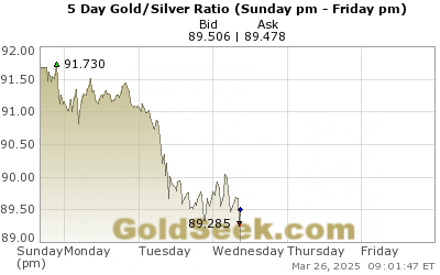
1. Gold:Silver Ratio
The gold-silver ratio represents the number of silver ounces it takes to buy a single ounce of gold.
- It has been one of the most reliable technical ‘buy’ indicators for silver whenever the ratio climbs above 80.
- The gold-to-silver ratio has now spiked above 85, which is the highest level since 1991 and, amazingly, the ratio is currently higher than it was at the depths of the 2008-09 financial crisis.
 Source:


- 20-year average: 63.49
- 10-year average: 66.16
- 5-year average: 75.54
- 1-year average: 82.95
- 6-month average: 84.79
- 3-momth average: 85.65
- 1-month average: 86.72
- 7-day average: 88.28
When the ratio is high silver becomes more favorable because, relative to the ratio, silver is somewhat inexpensive. Watching the gold-to-silver ratio is a good strategy to follow when trying to accumulate either gold or silver.
Over the past 20 years, the ratio has averaged 63:1. The current ratio of 88:1 is very high historically and nearly 60% above the 20-year average. The ratio is signaling that silver is extremely undervalued relative to gold at this point in time.
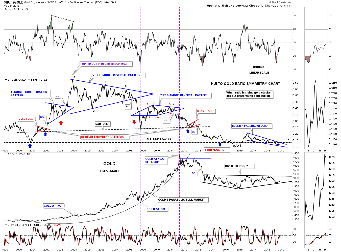
Two of the most followed commodity stock indices are the Philadelphia Gold/Silver XAU Index and the AMEX Gold Bugs HUI Index. The difference between the two is that:
- the HUI is a pure gold stock index and
- the XAU has both gold and silver mining companies.
2. HUI-to-Gold Ratio
The NYSE Arca Gold Bugs Index (HUI) – a modified equal dollar weighted index of companies involved in gold mining with BUGS standing for Basket of Unhedged Gold Stocks – to the price of gold bullion best reflects the relationship between bullion and gold miners than does the XAU since it does not include silver producers and long-term hedgers.

The combo chart below has the HUI:GOLD ratio on top and the HUI on the bottom and sums up how badly the HUI has done vs gold. Today the ratio is lower with the price of gold at $1250 than it was at the beginning of the HUI’s bull market in 2000 when the price was almost exactly $1000 lower . Pretty amazing when you think about it.
30-Year HUI:Gold Ratio:
3. Gold:XAU Ratio
Gold shares tend to typically lead the metal and provide a barometer of sorts when it comes to predicting the movement of the gold price or the gold equities themselves.
- When the gold price rises without the gold shares outperforming the gold price this is a warning that any intermediate term rally in both the metal and the gold equities may be heading for a temporary correction.
- Alternatively, if the gold shares fail to underperform the gold price as the gold price falls, this may indicate that the gold price and the gold shares are approaching a bottom in the correction and consolidation process which may offer a desirable entry point.

The chart below is a ratio combo chart which has the GOLD:XAU on top and the XAU on the bottom. When the ratio is rising gold is outperforming the XAU. Currently the price action is testing the top rail of a rising blue flag, while the XAU on the bottom chart is testing the bottom rail of its possible bullish falling wedge.
35-Year Gold:XAU Ratio
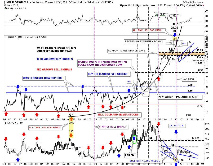
To really get this rally going in the precious metal stocks we need to see the ratio chart on top break to the downside in no uncertain terms.
- The very first thing we need to see happen is for the blue falling wedge on the XAU to breakout and move higher in an impulse type of move.
- The setup is there now we just need to see some follow through to the upside on the XAU.
4. GDX:Gold Ratio
- When the ratio is rising, it shows that gold miners are outperforming gold.
- When the ratio is falling, it shows the miners are underperforming gold.
- If the ratio doesn’t follow through to the upside,
- the price rally in gold is more likely to fail.
- It also shows that gold mining stocks are relatively weak compared to gold and, currently, the ratios seem weaker than it should be.
- If gold is heading higher, this ratio needs to head higher. If it doesn’t, it’s a warning sign.
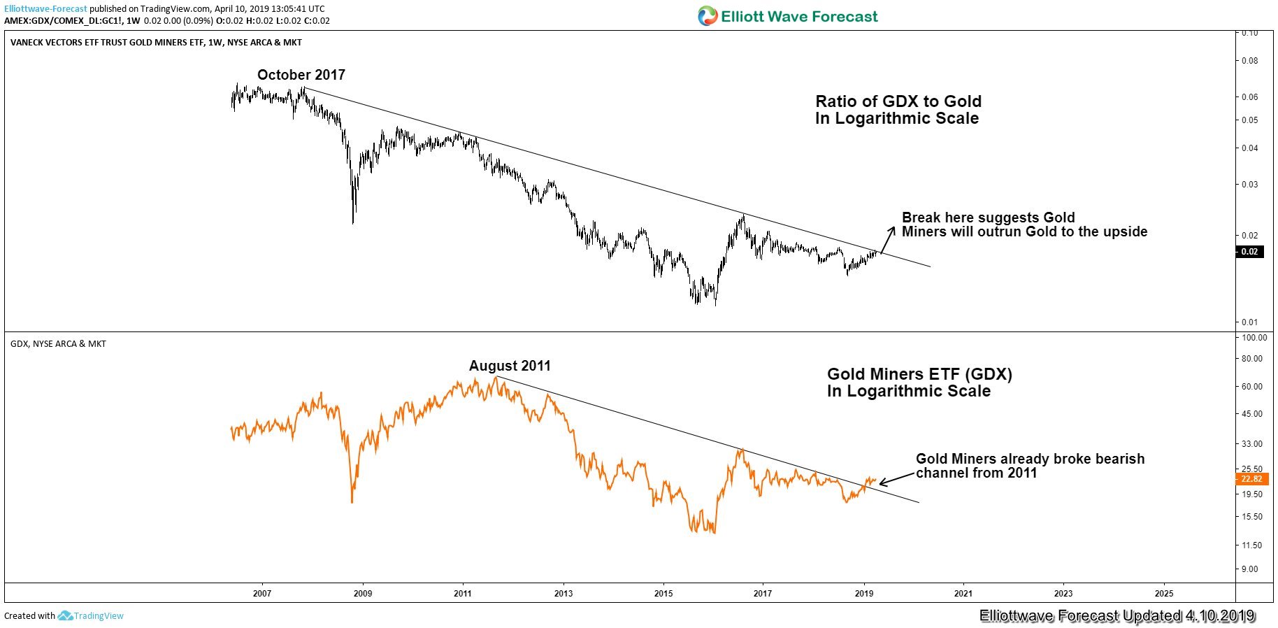
The GDX-to-Gold ratio (the upper chart) is retesting the bearish trend channel from October 2007 high.
- A break above this bearish trend line suggests that:
- the Gold Miners Index will outrun Gold to the upside due to rising ratio and
- the Gold Miners should go higher due to the positive correlation.
The GDX chart (the lower chart) has already broken the bearish trend line from August 2011.
- The break above the bearish trend line which suggests that:
- the Gold Miners GDX is ready to recover and rally more.
We can conclude from the above charts that Gold Miners could soon make a move to the upside, especially if we can see the GDX-to-Gold ratio breaking above the 2007 trend line.
5. GDXJ:GDX Ratio
Large gold producers populate the VanEck Vectors Gold Miners ETF (GDX) while the VanEck Vectors Junior Gold Miners ETF (GDXJ) consists of smaller, more speculative issues. The price ratio of GDXJ over GDX is a barometer of the risk investors are willing to assume when they commit capital to gold stocks:
- a rising ratio denotes an increasing appetite,
- a falling ratio indicates defensiveness.
The ratio’s current trend gives some nuance to the chart below.

Until recently, buyers favored larger mining stocks but now the ratio is bouncing off a double bottom at the 1.38 level, indicating renewed interest in more speculative issues. Technically, the ratio is shaping up for a test of 1.58, an area last visited in April 2017.
Summary
It pays to have an allocation to gold in your portfolio because:
- when the stock market tanks,
- the dollar tends to tank,
- which means the price of gold tends to go up significantly
- and, by also having exposure to gold stocks, you can more balance to your portfolio. It’s a big reason why you hear gold termed as “portfolio insurance.”
When stock markets are in complete chaos, investors run to gold for safety. The outsized returns you get from the move up in gold soften the blow from the drop in stocks. Depending on your allocation you could actually see nice gains in your portfolio.