If you believe that ignorance is bliss, you might not want to read this article. [Why? Because] I am going to dispel the notion that there has been any sort of “economic recovery”, and I am going to show that we are much worse off than we were just prior to the last economic crisis. [Ready to become informed? Then, read on!]
The comments above and below are edited excerpts from an article* by Michael Snyder (theeconomiccollapseblog.com) originally entitled 10 Charts Which Show We Are Much Worse Off Than Just Before The Last Economic Crisis.
If you go back to 2007, people were feeling really good about things. Houses were being flipped like crazy, the stock market was booming and unemployment was relatively low. Then the financial crisis of 2008 struck, and for a while it felt like the world was coming to an end. Of course it didn’t come to an end – it was just the first wave of our problems. The waves that come next are going to be the ones that really wipe us out.
Unfortunately, because we have experienced a few years of relative stability, many Americans have become convinced that Barack Obama, Janet Yellen and the rest of the folks in Washington D.C. have fixed whatever problems caused the last crisis. Even though all of the numbers are screaming otherwise, there are millions upon millions of people out there that truly believe that everything is going to be okay somehow. We never seem to learn from the past, and when this next economic downturn strikes it is going to do an astonishing amount of damage because we are already in a significantly weakened state from the last one.
For each of the charts that I am about to share with you, I want you to focus on the last shaded gray bar on each chart which represents the last recession. As you will see, our economic problems are significantly worse than they were just before the financial crisis of 2008. That means that we are far less equipped to handle a major economic crisis than we were the last time.
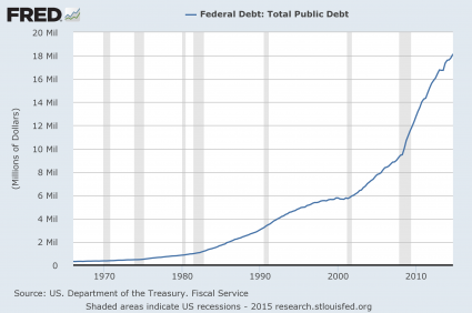
#1 The National Debt
Just prior to the last recession, the U.S. national debt was a bit above 9 trillion dollars. It has nearly doubled since then so does that make us better off or worse off? The answer, of course, is obvious, and even though the current Administration promises that “deficits are under control”, more than a trillion dollars was added to the national debt in fiscal year 2014. What we are doing to future generations by burdening them with so much debt is beyond criminal…[yet the current Administration] wants to ramp up government spending and increase the debt even faster!…
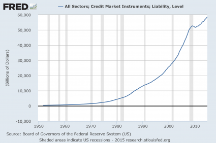
#2 Total Debt
Over the past 40 years, the total amount of debt in the United States has skyrocketed to astronomical heights. We have become a “buy now, pay later” society with devastating consequences [awaiting us]. Back in 1975, our total debt level was sitting at about 2.5 trillion dollars. Just prior to the last recession, it was sitting at about 50 trillion dollars, and today we are rapidly closing in on 60 trillion dollars.
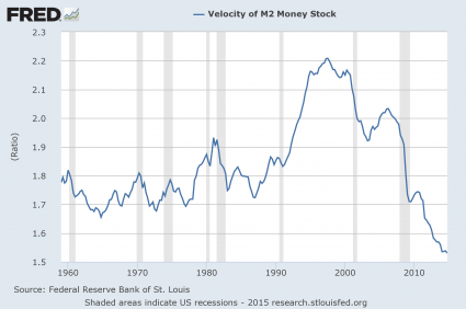
#3 The Velocity Of Money
When an economy is healthy, money tends to change hands and circulate through the system quite rapidly, so it makes sense that the velocity of money fell dramatically during the last recession – but why has it kept going down since then?
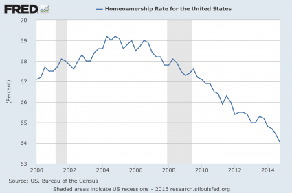
#4 The Home Ownership Rate
Were you aware that the rate of home ownership in the United States has fallen to a 20 year low? Traditionally, owning a home has been a sign that you belong to the middle class and the last recession was really rough on the middle class, so it makes sense that the rate of home ownership declined during that time frame – but why has it continued to steadily decline ever since?
#5 The Employment Rate
[The current Administration]…loves to tell us how the unemployment rate is “going down”but, as I will explain later in this article, this decline is primarily based on accounting tricks. Posted below is a chart of the civilian employment-population ratio. Just prior to the last recession, approximately 63% of the working age population of the United States was employed. During the recession, this ratio fell to below 59% and it stayed there for several years. Just recently it has peeked back above 59%, but we are still very, very far from where we used to be, and now the next economic downturn is rapidly approaching.
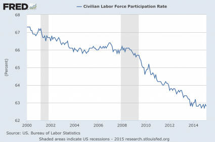
#6 The Labor Force Participation Rate
…How can [the current Administration]…get away with saying that the unemployment rate has gone down dramatically? Well, each month the government takes thousands upon thousands of long-term unemployed workers and decides that they have been unemployed for so long that they no longer qualify as “part of the labor force”. As a result, the “labor force participation rate” has fallen substantially since the end of the last recession…
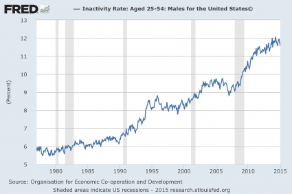
#7 The Inactivity Rate For Men In Their Prime Working Years
If things are “getting better”, then why are so many men in their prime working years doing nothing at all? Just prior to the last recession, the inactivity rate for men in their prime working years was about 9%. Today it is just about 12%.
#8 Real Median Household Income
Not only is a smaller percentage of Americans employed today than compared to just prior to the last recession, the quality of our jobs has gone down as well. This is one of the factors which has resulted in a stunning decline of real median household income.

I have shared these next numbers before, but they bear repeating. In America today, most Americans do not make enough to support a middle class lifestyle on a single salary. The following figures come directly from the Social Security Administration:
- 39% of American workers make less than $20,000 a year,
- 52% make less than $30,000 a year,
- 63% less than $40,000 a year and
- 72% less than $50,000 a year!
We all know people that are working part-time jobs because that is all that they can find in this economy. As the quality of our jobs continues to deteriorate, the numbers above are going to become even more dismal.
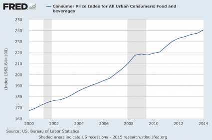
#9 Inflation
Even as our incomes have stagnated, the cost of living just continues to rise steadily. For example, the cost of food and beverages has gone up nearly 50% just since the year 2000.
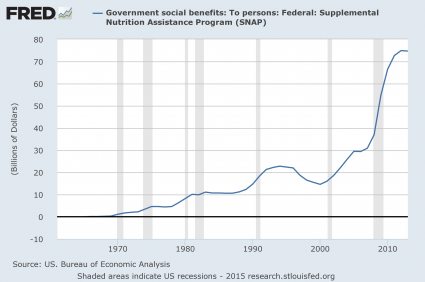
#10 Government Dependence
As the middle class shrinks and the number of Americans that cannot independently take care of themselves soars, dependence on the government is reaching unprecedented heights. For instance, the federal government is now spending about twice as much on food stamps as it was just prior to the last recession. How in the world can anyone dare to call this an “economic recovery”?
Conclusion
…Are things “getting better” or are they getting worse? To me, it is crystal clear that we are in much worse condition than we were just prior to the last economic crisis…
[The above article is presented by Lorimer Wilson, editor of www.munKNEE.com and has been edited ([ ]), abridged (…) and/or reformatted (some sub-titles and bold/italics emphases) for the sake of clarity and brevity to ensure a fast and easy read. The author’s views and conclusions are unaltered and no personal comments have been included to maintain the integrity of the original article. This paragraph must be included in any article re-posting to avoid copyright infringement.]
*Original Source: http://theeconomiccollapseblog.com/archives/10-charts-which-show-we-are-much-worse-off-than-just-before-the-last-economic-crisis (Copyright © 2015 The Economic Collapse)
Related Articles from the munKNEE Vault:
1. Get Your Head Out Of the Sand – the Red Flags Are Starting to Flap!!
Just because something has happened in the past does not mean that it will happen in the future but the fact that so many red flags are appearing all at once has got to give any rational person reason for concern. What red flags, you ask? Read on! Read More »
2. “Checkmate” Is Right Around the Corner For Stock Market & Economy – Here’s Why
Economically we are experiencing the birth pangs of the coming Great Depression and, as we get closer to the crisis that is looming on the horizon, they will become even more powerful. The warning signs are all there – we just have to be open to what they are telling us. This article identifies the many parallels between past economic downturns and what is happening right now. Read More »
3. Are These Views Of the Economy Fear Mongering OR Insightful? You Be the Judge
Will 2015 be a year of financial crashes, economic chaos and the start of the next worldwide depression? Personally, I am entirely convinced that the financial markets are more primed for a financial collapse now than they have been at any other time since the last crisis happened nearly seven years ago and I am certainly not alone. Read More »
4. Is An Economic Crash Coming Soon? These Analysts Think So – Here’s Why
Dozens of “analysts are convinced that the U.S. economy is going to hell in a hand basket – and soon. How sound are their analyses of the current economic situation? Will they be proven to be very insightful or nothing less than fear mongers looking for attention? Their views are all here. You be the judge. Read More »