[While] I do not prescribe to the 2012 end of the world or end of an era phenomenon, my recent fractal (pattern) analysis of the Dow suggests that it is forming a similar pattern to that which was formed in the late 60s to early 70s and if this pattern continues in a similar manner…the Dow could indeed have an annus horribilis (horrible year) in 2012. Let me explain. Words: 1416
So says Hubert Moolman (www.hubertmoolman.wordpress.com) in edited excerpts from his original article*.
Lorimer Wilson, editor of www.FinancialArticleSummariesToday.com (A site for sore eyes and inquisitive minds) and www.munKNEE.com (Your Key to Making Money!) has edited ([ ]), abridged (…) and reformatted (some sub-titles and bold/italics emphases) the article below for the sake of clarity and brevity to ensure a fast and easy read. The report’s views and conclusions are unaltered and no personal comments have been included to maintain the integrity of the original article. Please note that this paragraph must be included in any article re-posting to avoid copyright infringement.
Moolman goes on to say, in part:
Below, is a long-term chart of the Dow:
I have highlighted two fractals on the chart. I have also indicated five points on both fractals to illustrate how they could be similar. Point 1 on both fractals was the exact point at which the Dow gold ratio made a significant peak. This is an important marker, and it gives credibility to the comparison of these two patterns.
It appears that the Dow is currently searching for that point 5. Point 5 could already be in, or it could be a little higher than the recent high (of 12,928). However, from a timing point of view, it is likely that we have reached point 5 already (a retest could still be possible).
If the current fractal continues its similarity to that of the late 60s to early 70s fractal, and if it stays exactly true to the past fractal (fractals do not always stay exactly true), the Dow could drop to 6,000. Since my other analysis suggests that we are at the end of era (an era of the corrupt debt-based monetary system) my worst-case scenario is a possible drop to 1000 (not necessarily in 2012), even though it appears highly unlikely.
The Dow vs. Gold
The Dow’s inflated value, relative to the value of gold, was brought about by this debt-based monetary system. It follows naturally that in the event of the debt-based monetary system collapsing (it will eventually); the Dow:gold ratio could go back to levels prior to the introduction of this system. This level could be anywhere between 0.2 and 1, in my opinion. Therefore, it is possible to have a gold price of $5000, with the Dow at 1000. I do not say that we will have these levels, but it is certainly possible. All I am saying is that we have to be prepared for extremes never before seen in our lifetime.
I have written before of how similar today’s conditions are to that of the Great Depression and, based on that analysis, today’s economic fundamentals certainly support the theory of a massive drop in the Dow, relative to gold and even the US dollar.
Now, if you think that gold cannot rise when the Dow has a massive drop as suggested above, then you should look at the following chart and think again:
I have compared the gold chart (top) from 1970 to 1975 to the Dow chart (bottom) for the same period. From the beginning of 1973, the Dow started a massive drop, while gold started a huge rally. Furthermore, the beginning of 1973 happens to be the same point as point 5 in the first chart.
Dow: Gold Ratio
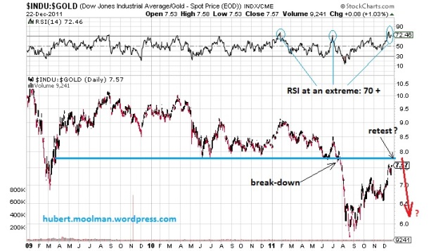
From a short-term perspective, the Dow:gold ratio is “overbought”, and could drop significant lower over the coming months. Below is a 3 year chart of the Dow:gold ratio:
On the chart, I have drawn a possible blue support line, which now could be resistance. It appears that the ratio broke down from that support in July this year, and is now in the process of retesting that break-down point. The RSI seems to be at a three-year extreme, and suggests that upside potential from here, could be limited. If the ratio turns around now or closer to that blue line, it could fall very fast.
Gold
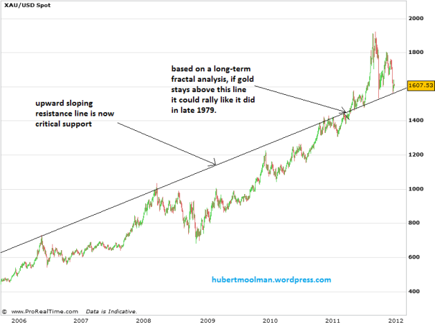
Gold appears to be at a very critical point of the bull market. See the chart below:
The gold price is currently holding just above the upward sloping line. Based on my long-term fractal analysis, this line is a critical area, and should price rebound form this line; it could rally like it did in late 1979.
*http://hubertmoolman.wordpress.com/2011/12/23/2012-the-dows-annus-horribilis-and-golds/
If you enjoyed reading the above article then:Sign-up for Automatic Receipt of Articles in your Inbox or via
FACEBOOK | and/or
TWITTER so as not to miss any of the best financial articles on the internet edited for clarity and brevity to ensure you a fast an easy read.
Related Articles:
1. Goldrunner: Gold Now on Its Way to $3,000+ By mid-2012
Our work with Gold is based on a “Model” off the late 70’s Gold Bull that has been replicating nicely since we started the Fractal Work with Gold back in 2002 and 2003. Short-term volatile moves in Gold, as we have seen over the past weeks, do not affect our projections based on the model, leaving the expectation of a move in Gold up to $3,000 into mid-year intact as outlined in our previous article entitled Gold Tsunami: on the Cusp of $3000+? Words: 996
2. Goldrunner: Gold, Silver and HUI Index to Bounce Back to Major Highs by May 2012
With the present major correction in gold, silver and the mining sector it is important to look at the big picture and see what the charts are saying from a technical fractal relationship with what happened back in 1979 when the last truely major bull run occurred. To date the situation is, frankly, no different than it was back then unfolding just as it should. As a result we can expect MAJOR upward price action in physical gold and silver and in their mining (producers, developers, explorers and royalty streamers alike) in the next few months on their way to their respective parabolic peaks in the years ahead. Read on. Words: 1604
3. Gold Tsunami: on the Cusp of $3,000+?
Early this year we suggested a 50% rise in Gold to $1860 – $1,920 into mid-year. Now, we see the Gold tsunami realizing an approximate 100% rise that will crest at $3,000+ into the middle of 2012, drowning any doubters in its wake. Below are a number of factors that support that view. Words: 1250
4. Goldrunner: The Gold Tsunami Wave Cycle
The Gold (and Silver) bull continues to closely follow the giant wave formation of a tsunami. The recent more parabolic rise in Gold up to above $1,900 is analogous to the little ridge of water we first saw way out in the distance, and now, much like when the waters recede from the shore early in the tsunami wave formation, Gold is undergoing a correction. Words: 1557
5. Goldrunner: The “GOLDEN PARABOLA” & “SILVER ROCKET” Update
The parabolic rise in Gold and in Silver still have a very long way to go as measured directly off of the late 1970’s Charts. In fact, we expect the arithmetic ratio targets for Gold and for Silver, based on the late 1970’s rise for each, to get blown away since we are seeing a logarithmic rise in dollar inflation compared to the late 1970’s. We have just hit the point where the more parabolic rise in Gold set off the leverage for the Gold Stocks in the late 1970’s. Therefore, we expect the real parabolic PM Stock Index Bull is just now commencing. Let me explain. Words: 1769
6. GOLDRUNNER: Gold on Track to Reach $1860 – $1920 by Mid-year
The Golden Parabola is continuing to follow the cycle of the 70’s Gold Bull as the U.S. Dollar is further devalued against Gold to balance the budget of the United States at this point in the “paper currency cycle” where Global Competitive Currency Devaluations rule. As discussed in a recent editorial this point in the cycle suggests that Gold will soon enter into a more aggressive higher rise in price to $1,860 – $1,920 per ozt. as it starts to project the higher Vth Wave characteristics of this new Golden Parabola. Let me explain. Words: 1403
7. Goldrunner: “$52 to $56 Silver by Mid-year” Update
Back on February 18th I wrote an editorial showing that Silver could rocket up to $52 to $56 by mid-year. At the time of the writing Silver was sitting a little above $32 on the price chart. The original chart work was based off of the fractal chart work I do with Silver from previous fractal time periods. So far the rise in Silver appears to be right on track for our expected targets to be approached into mid-year. [Let me review the details with you.] Words: 1069
 munKNEE.com Your Key to Making Money


