…[Below are 3] “charts from the PM complex…[that are] very helpful…[in figuring] out what the PM complex is up to…[and what they reveal is] pretty amazing when you think about it.” [Take a look.]
By Lorimer Wilson, editor of munKNEE.com – Your KEY To Making Money!
[This synopsis of edited excerpts* (419 words) from the original article (1171 words) by Plunger provides you with a 64% FASTER – and EASIER – read. Please note: This complete paragraph, and a link back to the original article, must be included in any article re-posting to avoid copyright infringement.]
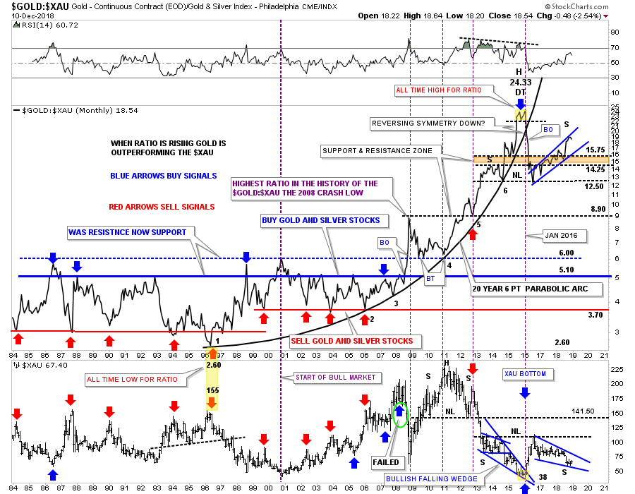
1. “This first chart is a ratio combo chart which has the GOLD:XAU on top and the XAU on the bottom…
Currently the price action on the ratio chart on top is testing the top rail of a rising blue flag, while the XAU on the bottom chart is testing the bottom rail of its possible bullish falling wedge…
To really get this rally going in the precious metal stocks:
- we need to see the ratio chart on top break to the downside in no uncertain terms. If the ratio chart ever trades back into its old trading range between 3.70 at the bottom and 5.10 at the top the PM stocks should be massively higher than where they are trading today.
- we need to see the blue falling wedge on the XAU break out and move higher in an impulse type of move. The setup is there now we just need to see some follow through to the upside on the XAU.
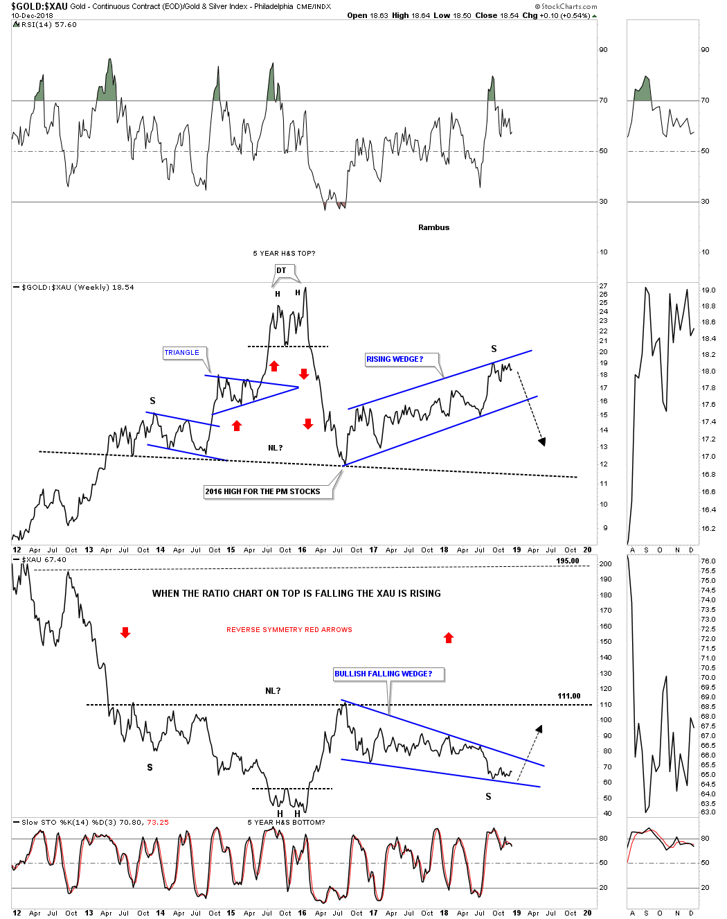
2. This next chart is a weekly ratio combo chart for the GOLD:XAU ratio on top and the XAU on the bottom…[and] shows the last seven years of the ratio combo chart above.
- Here you can see how the possible H&S top is building out on the ratio chart which in turn will show a possible H&S bottom on the XAU…
- It’s possible that we could be seeing the price action testing the top rail of the potential bearish rising wedge on the ratio chart with the potential test of the bottom rail of the bullish falling wedge on the XAU chart.
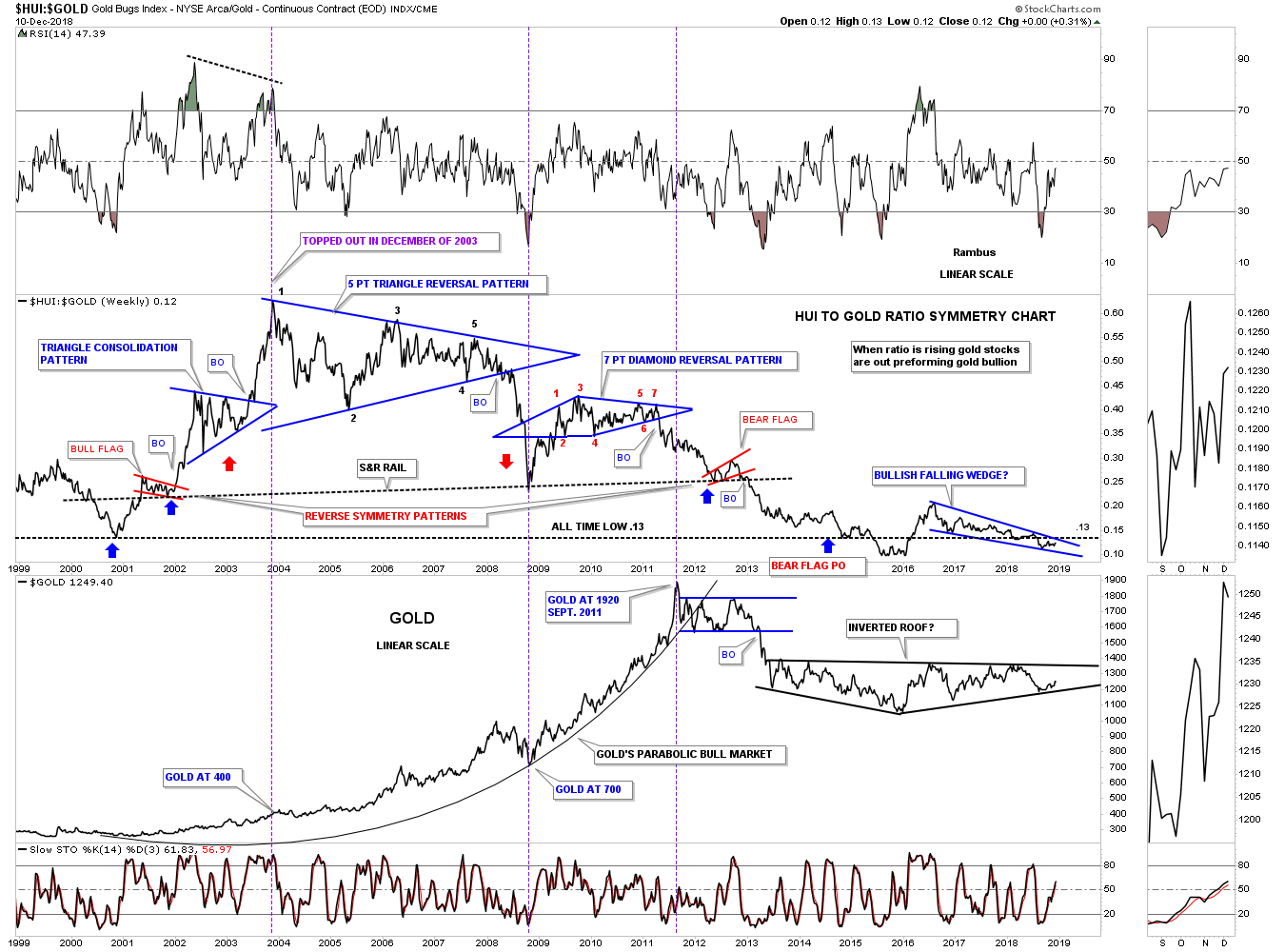
3. …[The] long term ratio combo chart…[below] has the HUI:GOLD ratio on top and the HUI on the bottom. This chart really sums up how badly the HUI has done vs GOLD…
The bottom line is that the ratio is now lower today with the price of gold at $1250 than it was at the beginning of the HUI’s bull market in Year 2000 when the price was almost exactly $1000 lower . Pretty amazing when you think about it.”
(*The author’s views and conclusions are unaltered and no personal comments have been included to maintain the integrity of the original article. Furthermore, the views, conclusions and any recommendations offered in this article are not to be construed as an endorsement of such by the editor.)
Scroll to very bottom of page & add your comments on this article. We want to share what you have to say!
Want your very own financial site? munKNEE.com is being GIVEN away – Check it out!A note from Lorimer Wilson, owner/editor of munKNEE.com – Your KEY to Making Money!:

“Illness necessitates that I spend less time on this unique & successful site so:
For the latest – and most informative – financial articles sign up (in the top right corner) for your FREE bi-weekly Market Intelligence Report newsletter (see sample here).
If you enjoyed reading the above article please hit the “Like” button, and if you’d like to be notified of future articles, hit that “Follow” link.
 munKNEE.com Your Key to Making Money


