We have been in the throes of a secular bear market, subject to strong cyclical swings in either direction, since 2000. [Currently, based on the 5 leading investment indicators analyzed in this article,] the measures all confirm that, from a longer-term perspective, the market remains overvalued. [Let’s take a look at each to see why that is the case.]
So writes Bob Seawright (http://rpseawright.wordpress.com) in edited excerpts from his original article* entitled Above the Market’s Leading Investment Indicators.
[The following article is presented by Lorimer Wilson, editor of www.munKNEE.com and may have been edited ([ ]), abridged (…) and/or reformatted (some sub-titles and bold/italics emphases) for the sake of clarity and brevity to ensure a fast and easy read. This paragraph must be included in any article re-posting to avoid copyright infringement.]
Seawright goes on to say in further edited excerpts:
Leading indicators are measures that typically change before the economy as a whole changes, thus providing some predictive power with respect to what lies ahead.
While the Conference Board publishes a Leading Economic Index intended to forecast future economic activity, my intent [here]…is to derive some Leading Investment Indicators. Unlike leading economic indicators, these metrics were designed:
- as longer term indicators of value, risk and expected returns [and, as such,] not as short-term predictors…[but] to measure potential real long-term returns [and, thus,]…in no way should be used as any sort of timing mechanism…[and]
- to be a helpful tool to help shape an overall investment thesis and process as well as to separate short-term and long-term concerns, not to dictate trading decisions.
1. PE10
The largest contributing factor to equity returns is the P/E ratio. The expansion or contraction of the broad market P/E ratio creates secular bull and bear markets. The chart below from Crestmont Research breaks down the components of total return for the S&P 500 for ten-year rolling periods.

Yale Professor Robert Shiller’s 10-year Average Inflation-Adjusted PE Ratio, also known as CAPE, Shiller PE or PE10, provides the best longer-term market gauge available. PE10 is the stock index price divided by the average real earnings from the previous 10 years – the time period is designed to smooth out near-term noise in the data. The basis for this approach is the finding that earnings valuation ratios provide predictive power for long-term stock market returns. Campbell & Shiller, “Valuation Ratios and the Long-Run Stock Market Outlook.” Journal of Portfolio Management 24, 2 (Winter 1998), pp. 11–26.
The long-term mean CAPE as calculated by multpl.com using Prof. Robert Shiller’s data is 16.45. In January 1921, PE10 was 5.12, the lowest value of any January in the historical period. Meanwhile, PE10 in January 2000 was 43.77, the highest January level in history. It is 22.19 today, suggesting that stocks remain significantly overvalued. Historical S&P 500 PE10 is charted below.
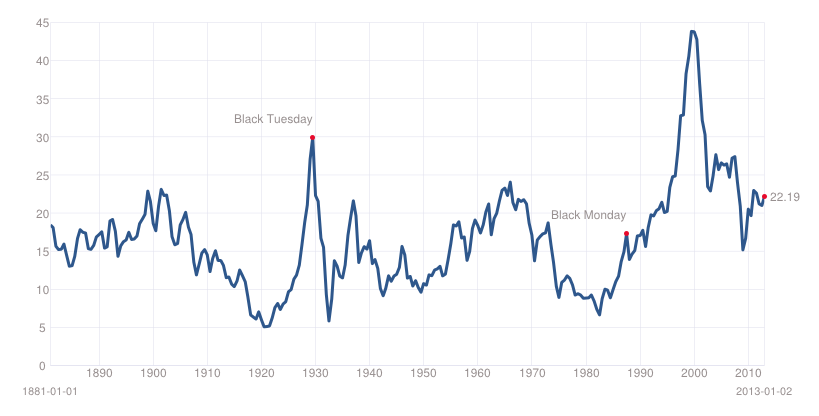
Source: multpl.com, using Prof. Shiller’s data
2. DY10
The dividend-price ratio or dividend yield (DY) is another predictor of the subsequent 10-year real returns on stocks, although this approach has its problems. Historical S&P 500 DY is charted below and suggests that stocks are significantly overvalued today.
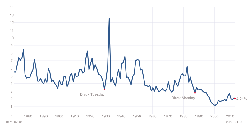
Source: multpl.com, using Prof. Shiller’s data
3. Tobin’s Q
The Tobin’s Q is the ratio of price to replacement cost, which is in many ways similar to book value…The most current Q ratio can be calculated from September’s release of the Flow of Funds report for Q2 2011. It is calculated by dividing line 35 of table B.102 by line 32. The historical data is also available on the St. Louis FRED website…[but] because the Flow of Funds report is released long after the quarter end, getting a relatively current level takes a bit of extrapolation.
When equity as a percentage of GNP is above-average then total real returns for U.S. equities have a high probability of being below average. When equity as a percentage of GNP is below-average then total real returns for U.S. equities have a high probability of being above-average. Another use for Q is to determine the valuation of the whole market in ratio to the aggregate corporate assets. The Q ratio is a statistical measurement of the market’s value; fair value for Q is 0.65, primarily because capital stock is routinely overstated leading to a larger denominator in the Q equation. (See Doug Short’s excellent analysis here).
Per Doug, the average (arithmetic mean) Q Ratio is about 0.70. The all-time Q Ratio high at the peak of the Tech Bubble was 1.78 — which suggests that the market price was 153% above the historic average of replacement cost. The all-time lows in 1921, 1932 and 1982 were around 0.30, which is about 57% below replacement cost….
Doug’s current estimate puts the ratio about 50% [updated] above its arithmetic mean:

and 62 percent [updated] above its geometric mean.

By this measure the market remains overvalued.
4. Market Cap to GDP
Market Capitalization to GDP has been described by Warren Buffet as “probably the best single measure of where valuations stand at any given moment.” It compares the total price of all publicly traded companies to GDP. This metric can also be thought of as an economy wide price to sales ratio. The data here is from the St. Louis FRED. However, because the data is quarterly, data for the other months have been entered using the prior ratio adjusted for the change in stock prices. As charted below, this metric suggests that stocks are significantly overvalued and overvalued as compared to October, 2011 and August, 2012 (.96 and 1.01 to the current 1.03).

Source: Vector Grader
5. Bond Yields
Returns on bonds depend on the initial bond yield and on subsequent yield changes. Low bond yields tend to translate into lower returns because of less income and heightened interest-rate risk. As Warren Buffett has pointed out (although he is not alone in this):
“Interest rates act as gravity behaves in the physical world. At all times, in all markets, in all parts of the world, the tiniest change in rates changes the value of every financial asset. …If interest rates are, say, 13 percent, the present value of a dollar that you’re going to receive in the future from an investment is not nearly as high as the present value of a dollar if rates are 4 percent.”
As charted below, long-term interest rates have been generally declining for more than 30 years and remain near record low levels, suggesting that all assets are at risk going forward.
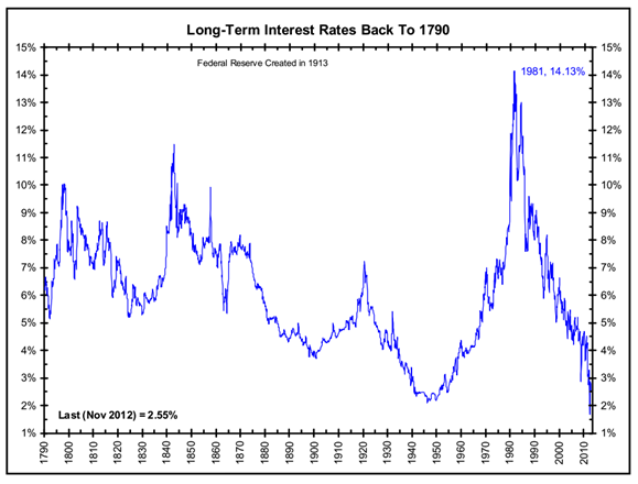
Source: The Big Picture (for a more limited period, the U.S. Treasury data is available for charting here)
Conclusion
These measures all confirm that, from a longer-term perspective, the market remains overvalued…We are (since 2000) in the throes of a secular bear market, subject to strong cyclical swings in either direction.
I continue to encourage investors to be skeptical, cautious, and defensive, yet opportunistic. I suggest that they look to take advantage of the opportunities that present themselves while carefully managing and mitigating risk, which should remain their top priority.
[Editor’s Note: The author’s views and conclusions in the above article are unaltered and no personal comments have been included to maintain the integrity of the original post. Furthermore, the views, conclusions and any recommendations offered in this article are not to be construed as an endorsement of such by the editor.]
*http://rpseawright.wordpress.com/2013/01/02/leading-investment-indicators-3/
Related Articles:
1. History Suggests Dow Has Only 4% More To Go Before Correcting

The Dow is just a “pinch away” from a series of resistance lines, ranging from 13 years to 31 years, that have marked important emotional highs & lows in the past suggesting that once the Dow reaches 16,000 or so it will correct. Read More »
2. Here’s How to Crash-Proof Your Portfolio

With the stock market seemingly reaching new highs every day, should we worry about a crash that puts an end to the party? If so, how should investors prepare? Let us explain. Read More »
3. What Does Stock Market Valuation Multiple Suggests for Future of S&P 500?

“The end is near” has been the bears’ dire prediction since the start of the bull market on March 9, 2009. This year’s rally to new record highs suggests that the bears have lost their credibility and that investors are becoming increasingly convinced that the end is actually still far off. Read More »
4. Wall Street Claims Secular Bear Market in US Stocks Is Over – Is It Justified?

Two charts today, both from Goldman Sachs, focusi on US equity valuations and suggest that the secular bear market in US stocks is over. Are we really experiencing an historical anomaly that falls into a “this time is different” narrative or is the current secular bear market not over just yet? Read More »
5. It’s Time to Apply the “Greater Fool Theory” and Sell Your Winners to All Those Fools
The Dow has surpassed its all-time record high – set in October 2007 – and the S&P 500 is not far behind? Is this the early stage of another great bull market? Let’s look back at the two previous times when the S&P 500 set new all-time highs and see if we can learn something. Wait…first put your “this time it’s different” glasses on. OK, let’s go. Words: 430; Charts: 1
6. Don’t Ignore This Fact: “Greedometer Gauge” Signals S&P 500 Drop to the 500s by July-August, 2013!
The S&P500 is likely to achieve a secular (long term) peak this month, then drop to the 500s by July-August 2013. This article explains why. Words: 180
7. This Metric Strongly Suggests a Major Correction in the S&P 500 Could Be Coming
History shows that when investors experience a rapid decline in the amount of available cash in their brokerage account to spend/invest quickly such “negative net worth” leads to major corrections in the stock market. Currently such is the case so can we expect another such decline or will it be different this time?
8. Watch Out For Falling Stocks! Here’s Why
The stock markets make no sense. They have literally lost touch with reality. Divergences between fundamentals, confidence and the valuation of markets are large [and, as such,] cannot last for long….The only question is how…and how quickly….this correction occurs. Words: 261
9. S&P 500′s PEG Ratio Suggests Overvaluation & Coming Correction

The S&P 500 index is trading at record high levels and optimism remains high with Barron’s professional money manager survey indicating a record 74% money managers being bullish on markets even at current levels. [When one] measures valuations with respect to expected growth, [however, the ensuing ratio, the PEG ratio,] suggests overvaluation at these levels. [Let me explain further.] Words: 254; Charts: 1 Read More »
10. You Need to Stay in the Stock Market Despite an Impending Economic Collapse – Here’s Why
You need to stay in markets despite an impending economic collapse. [Really?! Yes, really.] Normally such an expectation would be addressed by getting out of the way of the oncoming disaster and taking ones chips off the table [but,] in this situation, there is no place to hide. Low-risk assets, like bonds and near-cash, produce little to no return…and the threat of rising interest rates and inflation make them dangerous. Higher risk assets are unavoidable, given current conditions. [Let me explain further.] Words: 830
11. You Can Insure Your Portfolio From Potential Capital Loss – Here’s How
Most everything you’ve heard about investing from the mainstream media, your mutual fund advisor and your tax accountant is a lie. You’ve been told…that the entire point of portfolio diversification is to mitigate downside risk yet when the market experiences the inevitable decline, every sector pushes significantly lower – and your “diversified” portfolio suffers as a result, [right? Well, there IS a better way.] Hear me out. Words: 895
12. The U.S. Stock Market Is Overvalued By More Than 50%! Here’s Why
Key stock indices are becoming significantly overpriced. The value of the U.S. stock market stands at about 133% of GDP. The average for the past 60 years has been around 82%. By this measure, the U.S. stock market is overvalued by more than 50%! Words: 398
23. Stop! Don’t Forget Market Risk – Remember What Happened in 2000 & 2007/8.
Investors are more bullish now than at any time since 2002 but the current rally has not been fueled by improved prospects of actual growth and wealth creation. Instead, it’s mostly due to:
- investors desperate for income denied them elsewhere by central bank policies;
- printed stimulus cash seeking a home and
- sheer technical momentum
but nowhere do they seem to be considering market risk – the risk that your investment will lose value because it gets dragged down in a falling market. Words: 615
14. Ignore Wall Street Cheerleaders: Market Technicals, Fundamentals & Other Info Says Otherwise!
[In spite of what] the typical Wall Street cheerleaders, I mean strategists, are predicting, we see the equity market ever more closer to its cyclical top, miners about to retest a major bottom and hard assets with a new catalyst. [This article analyzes 9 pieces of information, complete with charts, that show what is actually going on in the marketplace at this point in time and what the short-term future holds.] Words: 930; Charts: 815. 5 Sound Reasons Investors Would Be Better Off On the Sidelines Than In the Market
New year festivities have continued on the stock market even as the Christmas trees have been put away. The “death of the fiscal cliff,” not horrible job numbers and supportive comments from Mario Draghi on the other side of the pond have led to bold and bullish behaviors over the last three weeks. While no one can predict the exact peak, here are five reasons you’re better off on the sidelines than in the market.
16. These Charts Suggest a Possible +/-60% Decline in the S&P 500 by 2014
J.P. Morgan Asset Management has developed a chart showing the past two cycles in the S&P 500 highlighting peak and trough valuations. At face value it is very alarming as it suggests a potential decline of somewhere in the vicinity of 60% over the next year or two and concurs with previous innovative trend analyses included in this article. Charts: 4
17. Current Market Overvaluation (from 33% – 51%!) Suggests Cautious Long-term Outlook
Based on the latest S&P 500 monthly data, [my analyses indicate that] the market is overvalued somewhere in the range of 33% to 51%, depending on which of 4 indicators I used. This is an increase over the previous month’s 31% to 48% range. [Let me explain the details.] Words: 475
18. Goldman Sachs’ Leading Indicators Signal Steep Market Crash Ahead
Goldman Sachs reports their Global Economic Indicators (GLI) show the world has re-entered a contraction and…is predicting a market crash worse than that of the early 90′s recession and one slightly less than the sell-off at the turn of the millennium. [Below are graphs to support their contentions.] Words: 250