I believe that our economic situation is vastly misunderstood. The future adverse consequences of this misunderstanding can not be understated. To highlight the situation I present below 10 charts on the economy that continue, on average, to depict a tenuous situation a full 73 months after the official June 2009 end of the recession. They highlight the “atypical” nature of our economic situation from a long-term historical perspective – and raise a lot of questions. To say there is much “on the line” here would be a complete understatement.
The above edited excerpts, and those below, come from 2 articles by Ted Kavadas (economicgreenfield.blogspot.ca) originally entitled Disturbing Charts (Update 19)* and A Special Note On Our Economic Situation** which can be accessed HERE & HERE, respectively.
While most economic and investment professionals believe that we are experiencing an economic recovery, I believe this assessment is incorrect… My analysis indicates that the current economic strength (dating back to roughly mid-2009) represents the type of intermittent economic strength that is often seen during periods of prolonged economic weakness. In other words, although it may seem as if the economy is experiencing a sustainable recovery, in fact we are in a Depression.
Assuming this is indeed a Depression, the implications are immense. We will experience further significant economic weakness. This weakness will be severe in nature. At some point unmitigated weakness will almost certainly pose the greatest challenge this nation has ever encountered.
What separates this period of economic weakness from those that have preceded it is its complexity. Absent a rather profound and rapid change in the effectiveness of our economic policies, we should not expect our economic predicament to improve in a sustainable manner.
The 10 charts below raise a lot of questions. As well, they highlight the “atypical” nature of our economic situation from a long-term historical perspective.
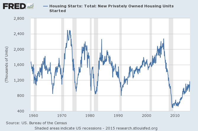
1. Housing starts:
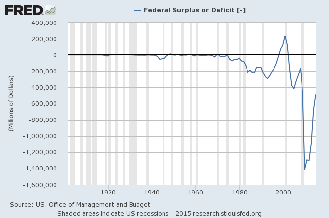
2. The Federal Deficit:
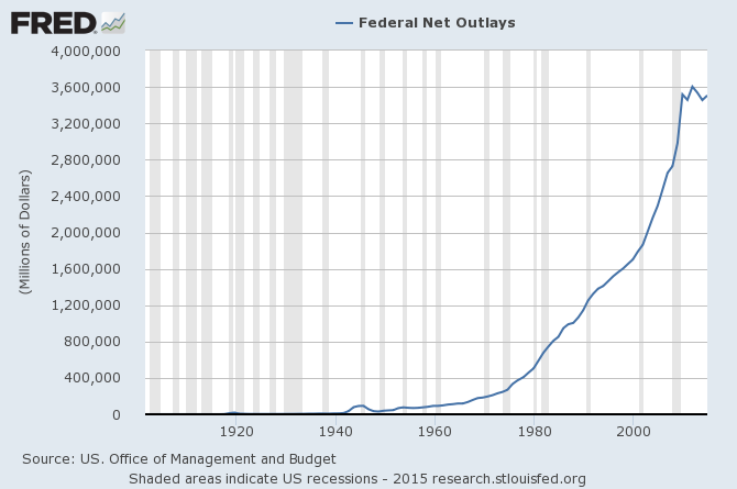
3. Federal Net Outlays:
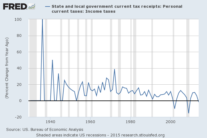
4. State & Local Personal Income Tax Receipts:
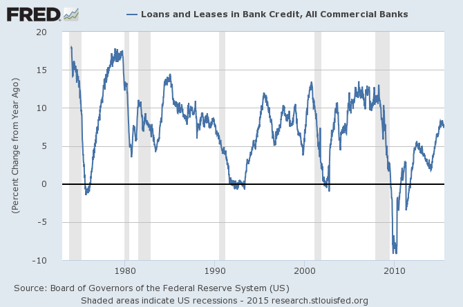
5. Total Loans and Leases of Commercial Banks (% Change from Year Ago):
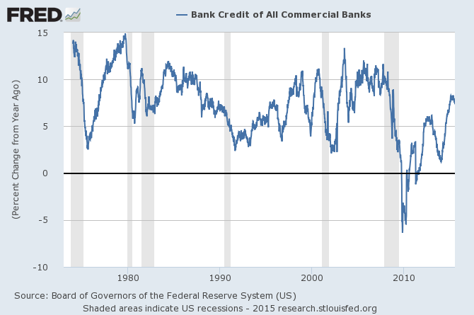
6. Bank Credit – All Commercial Banks (% Change from Year Ago)
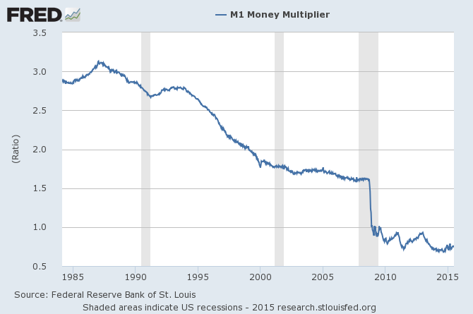
7. M1 Money Multiplier:
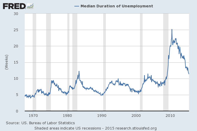
8. Median Duration of Unemployment:
9. Labor Force Participation Rate:

10. The Chicago Fed National Activity Index (CFNAI) 3-month moving average (CFNAI-MA3):

*http://economicgreenfield.blogspot.ca/2015/07/disturbing-charts-update-19.html & http://economicgreenfield.blogspot.ca/p/special-note-on-our-economic-situation.html