Automatically receive the internet’s most informative articles bi-weekly via our free bi-weekly Market Intelligence Report newsletter (sample here). Register in the top right hand corner of this page.
…This article takes a look at…how this most recent market crash compares with the market crashes of 1929, 1987, 2000, and 2008-2009 and… how the economic backdrop of each crash differed to assess what conditions to look for in buying opportunities after this crash.
Market Crash #1: 1929
The market “crash of 1929” was actually just the start of a very long bear market that lasted into 1932, and signaled the start of the great depression of the 1930s…
The long-term logarithmic chart of the Dow Jones Industrial Average (DJIA) below shows the noticeable drawdown of this crash/bear market:
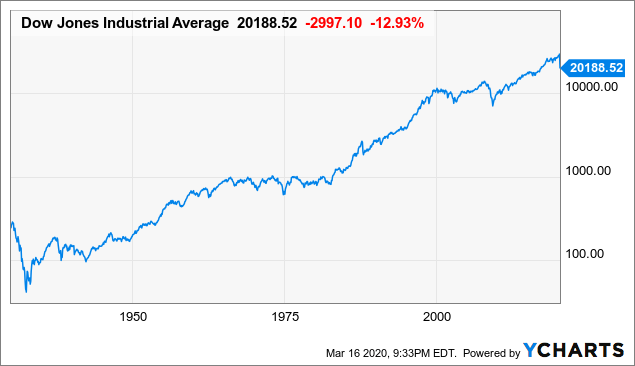
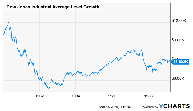
Zooming in, we can see that $10,000 invested in the DJIA on September 17th, 1929, ignoring dividends, would have fallen in value to around $2,500 by mid 1932, and still only be worth less than $6,000 ten whole years later.
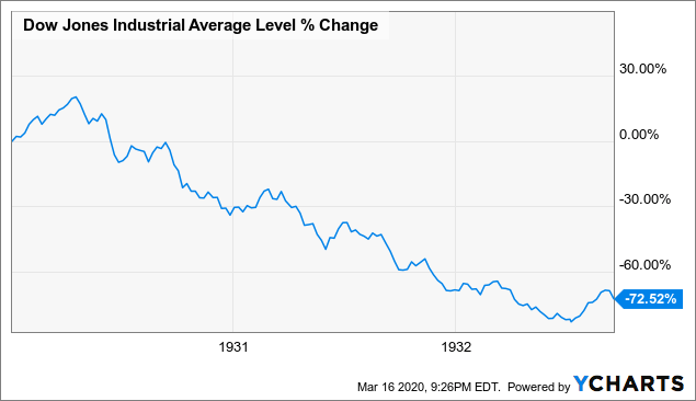
Zooming in even further, this is the three years of decline from September 17th 1929 to 1932 visualized.
This is a very well documented period in history:…
- Much of the run up to the stock market high of 1929 was due to individual chasing of rising stock prices, without concern for fundamentals, and fueled by excessive margin leverage, often as high as 10:1.
- In addition to falling valuations, the Great Depression also depressed the earnings denominator of companies for most of the 1930s, and perhaps through the end of World War II in 1945.
The hope of this market crash (and, for that matter, the crashes of 1987, 2000, and 2008-2009) to not become as bad as that of 1929-1933 is likely based on:
- stricter margin rules,
- greater attention to fundamentals,
- more institutional and corporate buyers of shares to support prices on dips, and
- sufficient fiscal and monetary response from national treasuries and central banks to prevent another great depression.
Market Crash #2: 1987
The great “flash crash”…[occurred] on October 19th, 1987…[and] seems very similar to the crash of 2020 (so far)…[in that]:
- The crash happened very quickly, and
- The crash only wiped out gains over the previous year.
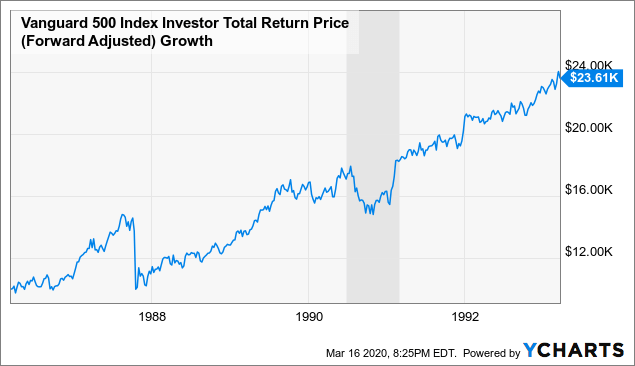
The optimist…might be expecting a repeat of the smooth recovery of the 1987 crash to the pre-crash high within 2 years after the crash of 1987 but…the crash of 1987 was largely driven by trading mechanics, and not by any actual economic recession.
As the chart below shows of a leading S&P 500 index fund at the time, the Vanguard 500 Index Fund Investor Class, the next U.S. recession did not occur until late 1990/early 1991. During the 1990-1991 recession, the market fell less and recovered more quickly than in the crash of 1987.
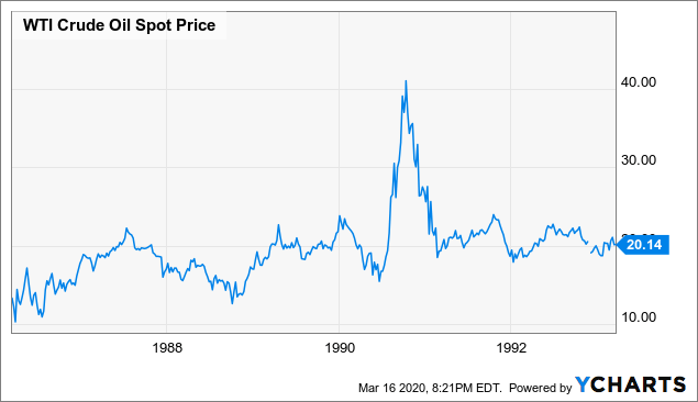
One other view on “how things have changed” is to see how oil prices moved during the crash of 1987, the recession of 1990-1991, and the crash of 2020.
- That the crash of 1987 was driven by “portfolio insurance” traders, and not by economics, can probably be seen by the lack of move in oil prices during the crash of 1987.
- The 1990-1991 recession, on the other hand, was very much paired with the spike in oil prices, which I remember being connected to Iraq’s invasion of Kuwait and following Gulf War.
Market Crash #3: 2000
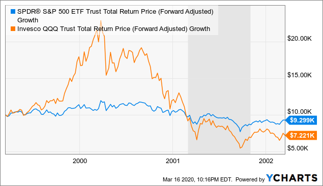
… In the chart below, I compare the S&P 500 tracker SPY with the tracker of the tech-heavy Nasdaq-100 index, the Invesco QQQ Trust.
- Compared with other “crashes” this chart makes 2000 seem like a year of normal volatility for SPY, and really only a 70% crash for the (most technology) stocks weighted heavily in QQQ.
- As far as the economy, the recession only hit in 2001, after QQQ had already lost most of its value, and despite the horrible disaster of 9/11, buy and holders of either QQQ or SPY almost anytime in 2001 likely had no financial regrets many years later.
The main lesson I took away from 2000 was the importance of paying attention to valuation, and understanding the actual source of profit underlying any business you buy shares in…
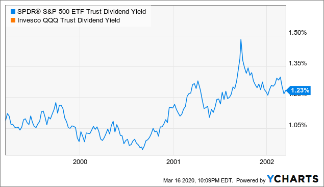
…While dividends are far from a perfect value indicator (and the lack of one wouldn’t stop me from buying Berkshire Hathaway), it remains one of the simplest indicators of whether the companies you own stock in can and will return cash to you.
The chart below plots SPY’s dividend yield, versus no dividend for QQQ:
Market Crash #4: 2008-2009
…Unlike 1987, 2000, or 2020, the crash of 2008 actually happened well into a U.S. recession…Perhaps like when the coronavirus was mostly in China, most of the market didn’t seem to consider the mortgage default “virus” any harder to contain than Bear Stearns’s liquidity problems. It was only six months later, almost exactly, when Lehman Brothers was allowed to default on its debt, that ripples were sent throughout the financial system and the economy.
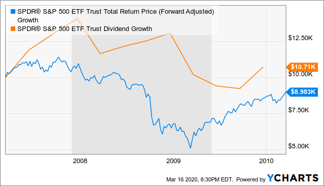
The first chart of SPY below shows the whole period from March 17th 2007 to March 17th 2010, and how its total return held up before and after the Lehman crash. For reference, I also included a line showing that overall SPY dividends were flat to slightly down over this period, again indicating that the price move was an over reaction to actual lost profits.
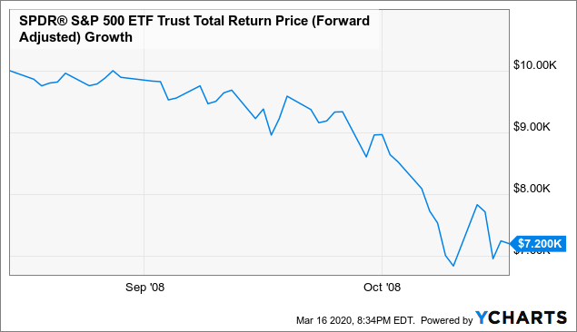
Zooming in, here are the two months where SPY fell 27% from mid-August to mid-October 2008. Many observers have pointed out that were where we are now in the 2020 crash is similar to where we were in mid-October 2008, where there was still a double-digit decline to go before the market hit bottom.
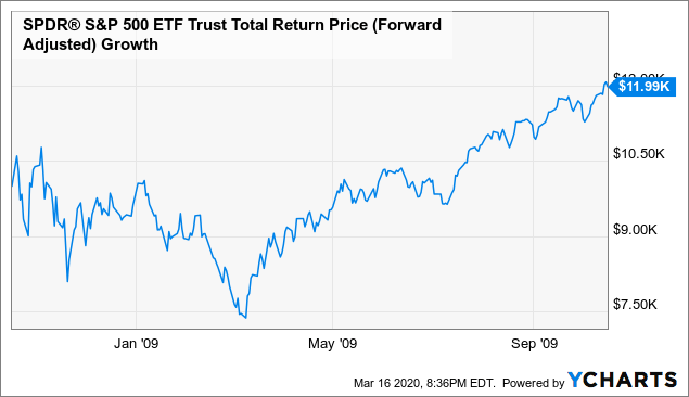
Even though volatility continued for months, it seems that buyers who spread out purchases just after the Lehman crash, throughout Q4 of 2008, would have seen a drawdown of another 25%, but then were up 20% within a year.
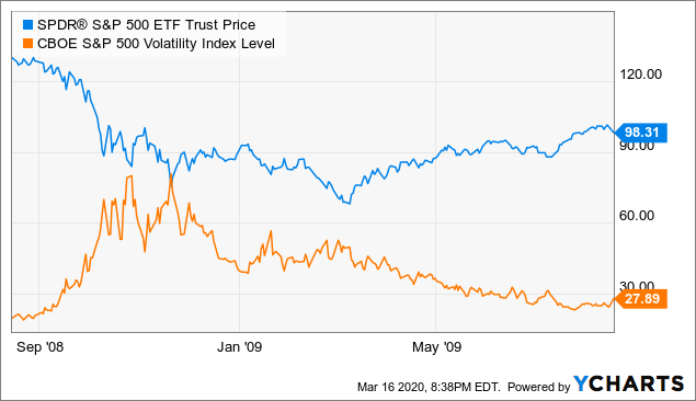
When trying to “be greedy when others are fearful”, I also tend to look at the volatility index, or VIX, as the “fear index” of how afraid the market is.
- The VIX can basically be thought of as a measure of what percentage, up or down, the market expects the S&P 500 to move on an annualized basis over the next 1 month, with roughly 67% confidence.
- Divide the VIX by the square root of 12 (about 3.46), and you get a back of envelope estimate for how much the market is betting the S&P will move, up or down, over the next month.
- The current VIX level above 70 may be read to imply an expectation of a 20% move over the next month (not hard when SPY has been moving 10% a day), but just as much indicates how much traders are willing to pay to buy options to protect against such moves.
As we can see historically, the bottoms in late 2008 coincided with times the VIX spiked above 60, but the lower bottom in early 2009 came when the VIX had already fallen to much lower levels.
A short summary of this VIX lesson is that:
- there is some pick up to be had in buying SPY when the VIX spikes,
- but be prepared for more drawdowns,
- and know the VIX may not be as high at the bottom.
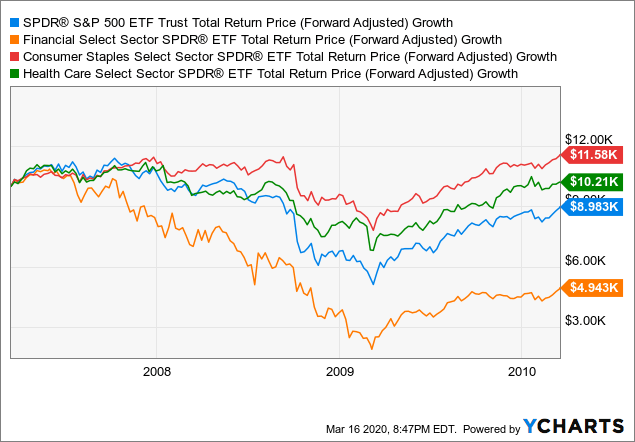
…The 2008-2009 crisis was very much a financial crisis, which hit the rest of our lives mostly via its impacts on banks and the financial system. Hard times for banks meant tighter credit, less lending, less trade finance, and less of many other accelerants of money through our economy. Even though other sectors were hit, a very large percentage of the drawdown fell on the financial components of the S&P 500, tracked by the Financial Select Sector SPDR ETF (XLF).
The following chart compares the performance of SPY versus XLF and the trackers of two other S&P 500 sectors: the Consumer Staples Select Sector SPDR ETF (XLP) and the Health Care Select Sector SPDR ETF (XLV). Financials clearly weighed down SPY, and investors tilted towards other sectors saw smaller drawdowns and higher balances for years to come.
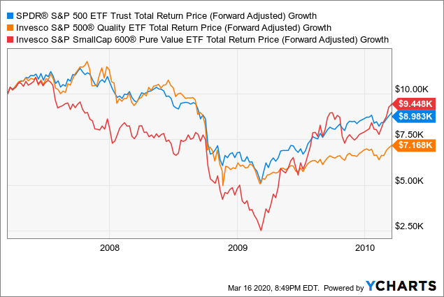
Two other factor I wanted to check to see how they performed versus the “core” S&P 500 are the “quality” factor, and “small value” stocks…[and] I use the Invesco S&P 500 Quality ETF (SPHQ) and the Invesco S&P SmallCap 600 Pure Value ETF (RZV) for those purposes.
What surprised me most in the chart below is how:
- the SPHQ tracked SPY before and during the crash, and then under-performed after the crash while
- the small value, as represented by RZV, had a much more dramatic 75% drawdown to the 2019Q1 low, but eventually came out ahead of both SPY and SPHQ.
It might have required far more courage, but it seems whether you bought RZV after the crash 50% or 75% off its highs, you would have ultimately been more handsomely rewarded.
Conclusion
The four examples [above] can, obviously, only tell us what happened in past crashes, and there will, of course, be ways that this crash is different, but human nature tends to remain the same, and the way large institutions manage economic and markets cycles has evolved in ways we’ve seen in the past three crashes.
Although my tendency after crashes is to bargain hunt for quality…small value, while more volatile and often not coming with quality filters or tilts, seems like it may be even more rewarding the lower we can buy it. All this of course assumes we don’t enter another great depression, and that 2022-2030 corporate earnings are on trend with what they were earlier.
Editor’s Note: The original article by Kelsey Williams has been edited ([ ]) and abridged (…) above for the sake of clarity and brevity to ensure a fast and easy. The author’s views and conclusions are unaltered and no personal comments have been included to maintain the integrity of the original article. Furthermore, the views, conclusions and any recommendations offered in this article are not to be construed as an endorsement of such by the editor. Also note that this complete paragraph must be included in any re-posting to avoid copyright infringement.
Related Articles From the munKNEE Vault:
1. Similarities Between What Led Up To the Crash of 1929 & What’s Occurring Today (+3K Views)
2. How Accurate Is The VIX At Projecting Stock Market Movement? (+2K Views)
3. Coming Stock Market Crash Will Mirror Debacles Of 2001 & 2008 (+2K Views)
4. The Stock Market Needs A 1987-like Crash – Here’s Why
5. Another 35% Crash In the Stock Market Would Not Be That Unusual – Here’s Why
9. Take Note: Economic Events Similar to Those of Great Depression Approaching! (+5K Views)
10. Perspectives On The Great Depression & Resultant Deflation (+2K Views)
11. The “Greater” Depression Has Started & It’s Quite Different From the Last One
 munKNEE.com Your Key to Making Money
