Whenever the Fed has decided to reduce the extent of their purchases of “agency” debt products, the SP500 has also declined in a dramatic way. [As such,]… it makes it extremely important to contemplate a “tapering” off in the rate of growth of Fed assets, or even an outright end to quantitative easing (QE). [Indeed, if you own stocks you may well want the Fed QEternity program to be just that – to eternity – in spite of the inflation that will surely follow.]
The above are edited excerpts from an article by Tom McClellan from his McClellan Market Report (mcoscillator.com/market_reports/) as featured by Cullen Roche (pragcap.com) in an article* entitled Perhaps The Only Chart That Matters (For Now).
[The following is presented by Lorimer Wilson, editor of www.munKNEE.com and the FREE Market Intelligence Report newsletter (sample here). The excerpts may have been edited ([ ]), abridged (…) and/or reformatted (some sub-titles and bold/italics emphases) for the sake of clarity and brevity to ensure a fast and easy read. This paragraph must be included in any article re-posting to avoid copyright infringement.]
McClennan goes on to say in further edited excerpts:
This week’s chart compares the SP500 to the total assets held by the Fed. That plot is made up from the total of the Fed’s Treasury holdings and its mortgage backed securities (MBS), which are sometimes referred to as “agency” debt products. The agencies which that title refers to are Fannie Mae, Freddie Mac, etc.

Putting the chart together this way helps us see just how important the Fed’s purchases have been to the task of sustaining the bull market for stocks. Whenever the Fed has decided to change the slope of the green line, the slope of the SP500 has also changed in a dramatic way. That makes it such an important question to contemplate a “tapering” off in the rate of growth of Fed assets, or even an outright end to quantitative easing (QE).
This chart also helps us see just how critical the Fed’s actions were in bringing about the awful bear market of 2007-09. Back then, the Fed just held Treasuries, and it did not start buying agency debt until January 2009. The Fed’s holdings of Treasury debt peaked in August 2007 at $790 billion, and over the next 17 months the Fed sold off more than $300 billion of those holdings. That’s right, in the middle of the worst liquidity crisis in decades, with banks folding and with Congress handing out tax rebates, the Fed was pulling liquidity OUT of the banking system.
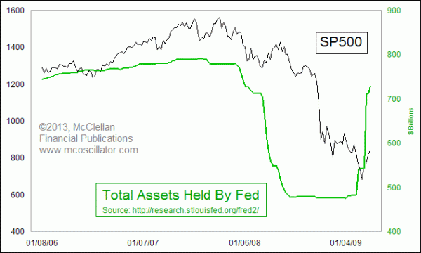
When the Fed finally stopped pulling liquidity out of the system and started adding it back in again in early 2009, the market turned upward, and the banking system and economy started working their way back toward health again….
Will all of this QE someday bring us inflation?
Of course it will, because it already has. In recent decades, many people including Fed officials have come to think of “inflation” as what happens to consumer prices but the original definition of inflation refers to the excessive expansion of the money supply. QE is inflation. So far, innovation and productivity gains are keeping prices from running away in step with the growth in the money supply but, rather than allowing consumers to enjoy the benefits of those lower prices, the Fed is confiscating that benefit for its own purposes, insisting on 2% annual growth in consumer prices instead of the “price stability” mandate given to the Fed by Congress.
When will it all end?
That is a hard question, because it goes to the thinking and the decisions of [only] the 12 voting members of the FOMC…Analyzing the collective decisions of millions of people can be modeled but forecasting the decisions of 12 people is a much harder task. It is worth noting, however, that back in 2007, the A-D Line actually peaked 3 months before the Fed’s Treasury holdings peaked and the April 2010 stock market top preceded the end of QE1. Likewise, the market peak in 2011 arrived before the end of QE2.
Conclusion
Therefore, it is not reasonable, given these historical events, to conclude that one can just wait to hear news about the end of QEternity in order to know when the top for stocks is going to arrive.
[Editor’s Note: The author’s views and conclusions in the above article are unaltered and no personal comments have been included to maintain the integrity of the original post. Furthermore, the views, conclusions and any recommendations offered in this article are not to be construed as an endorsement of such by the editor.]
* http://pragcap.com/perhaps-the-only-chart-that-matters-for-now (Copyright © 2013 All Rights Reserved)
Related Articles:
1. Stock Market Crash Coming, Then More QE & Then Commodity Price Spikes

Unknowingly, with QE Infinity, Bernanke has put in motion a runaway move in the stock market that will end in some kind of crash this summer. The crash will cause Bernanke to double down on QE which will trigger a spike in commodity prices. Let me explain my rationale. Read More »
2. Bookmark This Article: The Stock Market Will Crash Within 6 Months!
Until recently, I have not used the term “stock market crash”. I do not take using this term lightly. It brings with it major repercussions. I am now breaking out this phrase because of the current state of the stock market. This stock market crash will occur within the next six months from today… The markets will fall within a combined day/few days a total of at least 20%. Bookmark this article. Read More »
3.


The real value of the stock market is positively correlated, over time, with the amount of freight hauled by the nation’s trucks (in other words, the physical size of the economy has a lot to do with the real, inflation-adjusted value of the economy) and the latest numbers (see chart) strongly suggest that we are not in a stock market bubble. Read More »

It’s been an amazing run in the stock market but…I start to feel a bit uneasy about things when I see all news reported as good news, because it either means the economy is getting better or more QE is coming. The fact, though, is that the market is just driving higher on what looks like sheer optimism of continued QE and little else. You can see this optimism in two indicators you’ll recognize. Read More »