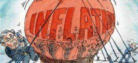
There have been many econoblog posts of the form, "ha, ha, the people predicting inflation have been wrong so far, when will they give up?". Let me try to explain why we know high inflation is coming eventually.
Read More »It’s Imperative That You Know ALL About Interest Rates! Here’s Why & How To Do So
I read hundreds of financial articles every week and most are nothing more than "financial entertainment" - unfounded forecasts, fear mongering or cheer-leading. That being said, there are a number of articles that are absolutely MUST READS if you are to become an informed investor and be in position to understand what is evolving in the financial environment and act accordingly. Introductory paragraphs and links to a number of them are provided in this post.
Read More »Bitcoins: How to Start Using Them & the Security Issues In Doing So (+3K Views)
How safe is the cash in your wallet? Just as with hard currencies such as dollars and pounds, the safety of your bitcoins depends on your own vigilance. If you are thinking about using Bitcoin, or already are, this infographic outlines the security concerns and how to go about alleviating them.
Read More »Should the FED Give Money Directly To Consumers Instead of the Banks?
There is an idea floating about to stimulate the economy via providing cash directly to consumers. It may just be a trial balloon at this point, but I expect the idea to gain traction. Here's why.
Read More »That Canada Is A Financial Safe-haven Is A Myth – Here’s Why
Canada is seen as the new banking safe haven and an “island of safety and stability” because of its perceived sound fiscal position, commodity wealth and solid economic performance - but it's a myth! Plain & simple. Here are the facts.
Read More »Today’s Financial Entertainment: “Cataclysmic Observations” Regarding Gold & Silver
Frankly, we cannot conceive of a more cataclysmic set of circumstances for both the global economy in general, and the gold Cartel specifically, than currently exist. Act now, before “traders” return from summer vacations next week or you may be locked out of the most important “protection trade” of all time!
Read More »U.S. Gov’t Ensnared in a Debt & Interest Rate Trap – Here’s What It Means For Gold
Should the Fed raise interest rates at some point in the future, as is widely expected, such higher interest rates might bring far worse consequences than can be achieved by simply staying the course. While some small, even token, rate hike would be tolerable, a return to historical norms could reap consequences in the general economy far beyond the direct effect on the federal government’s fiscal status. The fact is that the federal government is ensnared in a debt and interest rate trap of its own making from which it will be difficult to extricate itself.
Read More »What Affect Will Rising Interest Rates Have On Inflation & the Future Price of Gold?
Though the stock, bond and currency markets, at the moment, are preoccupied with the question of when the first interest-rate increase will happen, the real story lies in where interest rates are ultimately headed because that answer defines where stock, bond and currency prices are ultimately headed and the reality, dear reader, is that the Fed simply cannot — and will not — allow interest rates to crawl very high. Why is that you ask? Read on!
Read More »This is the Most “Stupid” USD Chart Around – Here’s Why (+2K Views)
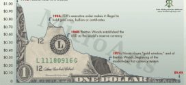
You’ve almost certainly seen the chart below over the years – it shows the purchasing power of the US Dollar over time - and it looks terrifying. I call it the "stupid" chart, though, because it is a total misrepresentation of the facts because it isn't telling the full story. Here's why.
Read More »Interest Rates Play A MAJOR Role In the Behavior Of the Stock Market – Here’s Why
To understand how the stock market behaves it is imperative to realize that the stock market is overwhelmingly influenced by interest rates. It’s difficult to overstate this key fact. Interest rates are the bone and marrow of the stock market. More specifically, the stock market is ruled by long-term and short-term interest rates creating an overriding framework for what drives the market in which different sectors do better or worse at different points in the economic cycle. This article explains the behavior more fully.
Read More » munKNEE.com Your Key to Making Money


