Amazingly, we are on the verge of a global deflationary downturn and what could be a historic bear market, yet Wall Street prognosticators remain focused on the inflationary risks of excessive monetary stimulus. Their focus could not be more wrong. Let me explain further.
Read More »Divergence of U.S. & Euro Area Economies Is Dramatic – and Tragic! Take a Look (+2K Views)
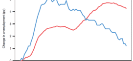
[Charts have the ability to clearly illustrate various situations and no 2 could be more so than the following charts] on the incredible divergence in the U.S. economy and the European economy as it related to the extent of unemployment and industrial production in each region. Take a look. It's truly amazing - truly tragic.
Read More »The 8 Major Companies, And Products, In the Booming Wearable Tech Sector
Wearable tech has come a long way from it's humble beginnings that started with the calculator watch and is likely on the brink of rapid ascension, especially with big hitters like Samsung and Apple pursuing the opportunity. Take a look at today's infographic and find out what kind of wearable gadgets you can get your hands on today from these and other top companies!
Read More »This Indicator Is 94% (Yes, 94%!) Negatively Correlated to Future Stock Market Returns!
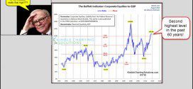
What investors are actually doing with their money – acting out of fear or greed – is a better predictor of future stock market returns than even Buffett’s favorite, and highly touted, total market capitalization-to-GNP valuation measure. How do we use this information as a contrary indicator? How do we put it into practice? Read on.
Read More »Wearable Technology Is Here & It’s A Game Changer! Here’s Why
Wearable technology has been around in some form since the 17th century. However, it is only in the last five years, with the miniaturization of technology that it has started to emerge as a game changer enabling businesses to increase productivity, reduce costs, and improve employment practices and providing consumers with many innovative and life-enhancing products.
Read More »Financial Advisors: Goodbye Baby Boomers, Hello Millennials! Are You Prepared? (+2K Views)
Many financial firms that focus on older, wealthier generations such as Baby Boomers are unprepared from the coming general shift. They will have to reshape their services and message to meet the needs of Millennials.The stakes are high for both sides. Here's why.
Read More »Europe’s Economic Recovery Has Run Out Of Steam! Here’s Why
Despite the European Central Bank's periodic assurances to the contrary, Europe is well on its way to a lost economic decade and if European policymakers cannot shake themselves out of their present state of complacency we should brace ourselves for very rough going in the global financial markets when the U.S. Federal Reserve starts the process of normalizing interest rates.
Read More »Major Economic Gap Between White & Black Americans – Here Are the Facts
I believe that what is happening in Ferguson is just a preview of what is coming to America in the years ahead and much of the anger and frustration that is bubbling just under the surface in our communities has an economic element to it. Let me explain.
Read More »12 Top Notch, But Low Cost, Retirement Spots Around the World (+2K Views)
Scanning the world map in 2014, 12 places stand out as top-notch retirement options and, while each place is different, all of them offer tremendously appealing lifestyles for the cost. Here's how much it costs to retire in these 12 great retirement spots.
Read More »Noonan: Not Owning Physical Gold & Silver Is A Huge Risk – Here’s Why (+2K Views)
Once the grip of the fiat “dollar” gives way, and it is slowly losing ground, then the price for gold and silver will find their more natural value - and not until then. When might that happen? It could be weeks, it could be months, maybe even another year or two, but whenever it happens, it is more likely to be an overnight “adjustment.” Plan accordingly.
Read More » munKNEE.com Your Key to Making Money


